Item 7
If there’s anything Nigerians love, it’s good food and a good time, and in this culture, “item 7” refers to the part of an event or party in which food is finally served.
Overview
Summary
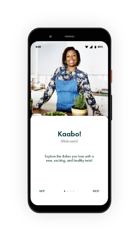
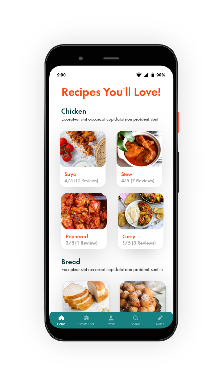
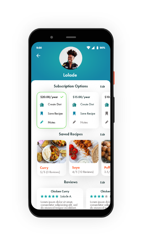
I worked with a client to bring her vision to life in the form of Item 7, a mobile health app that provides users a platform to find recipes for Nigerian dishes with a healthy twist and more.
Roles and Responsibilities
I facilitated this project as a UX generalist working pro-bono for a client, which included UX research, project management, and visual design. My responsibilities are listed below:
Interviewing the client to learn more about the target audience, narrow the project scope, and establish UX requirements
Creating a customer journey map, empathy map, and user flow
Sketching out potential solutions and wireframing
Creating a lo-fi clickable prototype for usability testing and a final hi-fi mockup

The Client
The Problem
In the Nigerian community, many women struggle with an array of health conditions as a result of poor diet and lack of resources on how to make Nigerian dishes more nutritious. To address this, my client wanted a design for an application where she could share the healthy Nigerian food recipes she had come up with for women in her community.
Target Audience
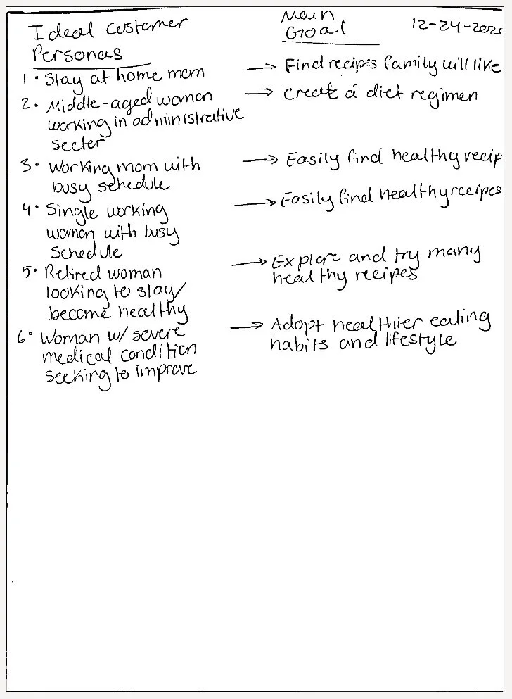
Ideal users are Nigerian women over the age of 40 who may be suffering from common health conditions like high blood pressure, blood sugar, and diabetes. These people are seeking ways in which they can improve their health through making changes to the cultural foods they eat.
My Solution
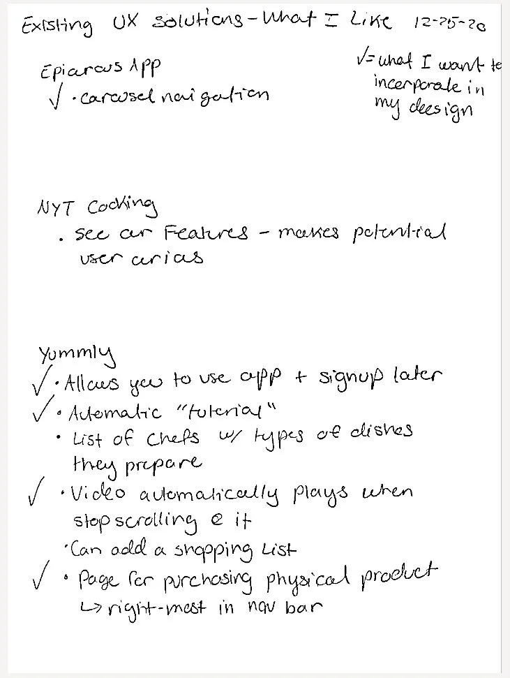
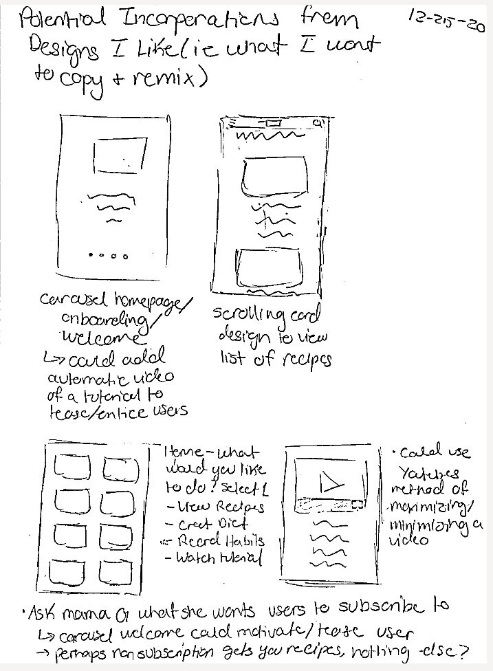
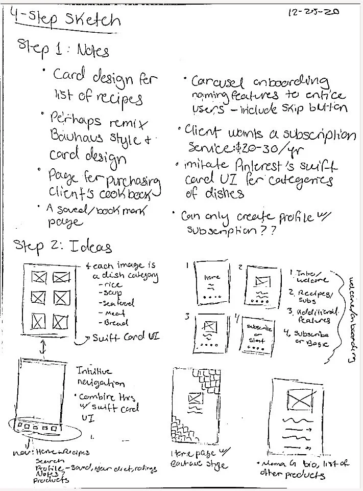
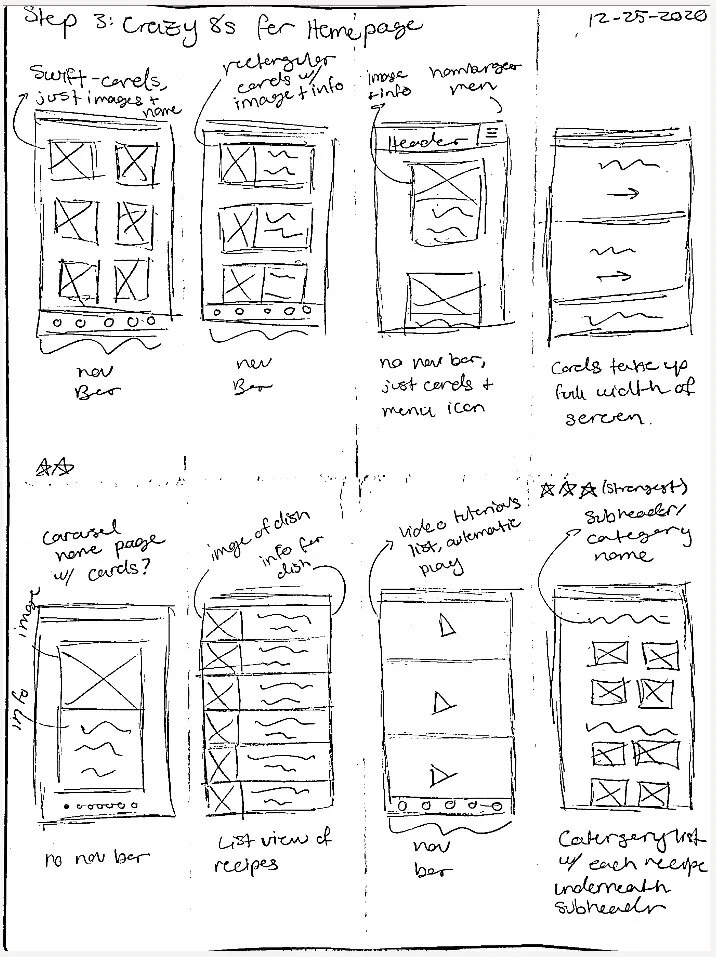
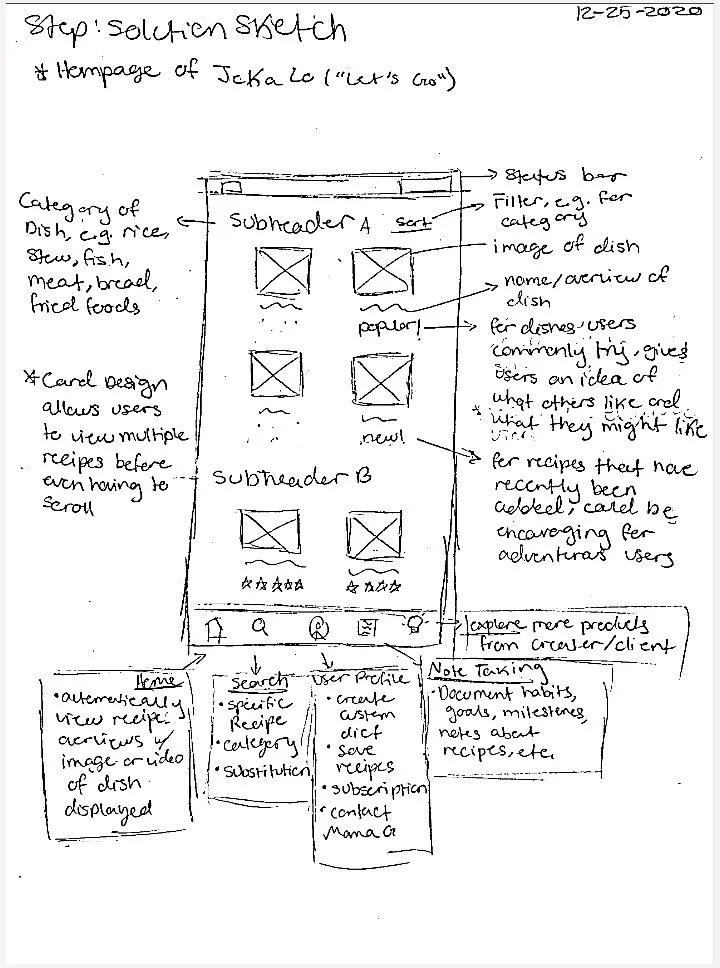
To solve the problem, my client tasked me with designing a mobile health food app for users to search through her recipes. I conducted extensive user research to understand the needs and experiences of the target audience, then researched, downloaded, and explored similar apps and took inspiration from their designs. Using Yummly, NYTimes Cooking, and Epicurious, I remixed a card style UI, subscription pages, and carousel onboarding. I then used the 4-step sketch method to sketch an initial design that addressed user needs and the client’s requirements. From there, I designed multiple wireframe iterations before applying visual styling to create a final mockup.
Discovery and Research
User Survey
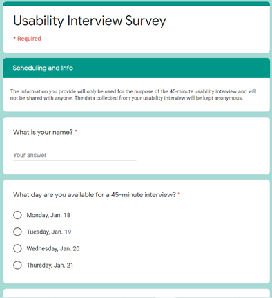
To recruit participants for usability testing, I created a user survey and sent it to friends and family members. The survey consisted of demographics and scheduling questions. Due to a variety of constraints, it was challenging to gather participants to take the survey who were also willing to participate in testing, but I was able to find 5 people to complete usability interviews. Of the five participants who took the survey:
2 are Nigerian women above the age of 40 with health conditions
2 are Nigerian men
1 is an American woman
Overall, the group included ideal users as well as additional users who could provide a diverse range of experience and feedback.
Customer Journey Map and Empathy Map
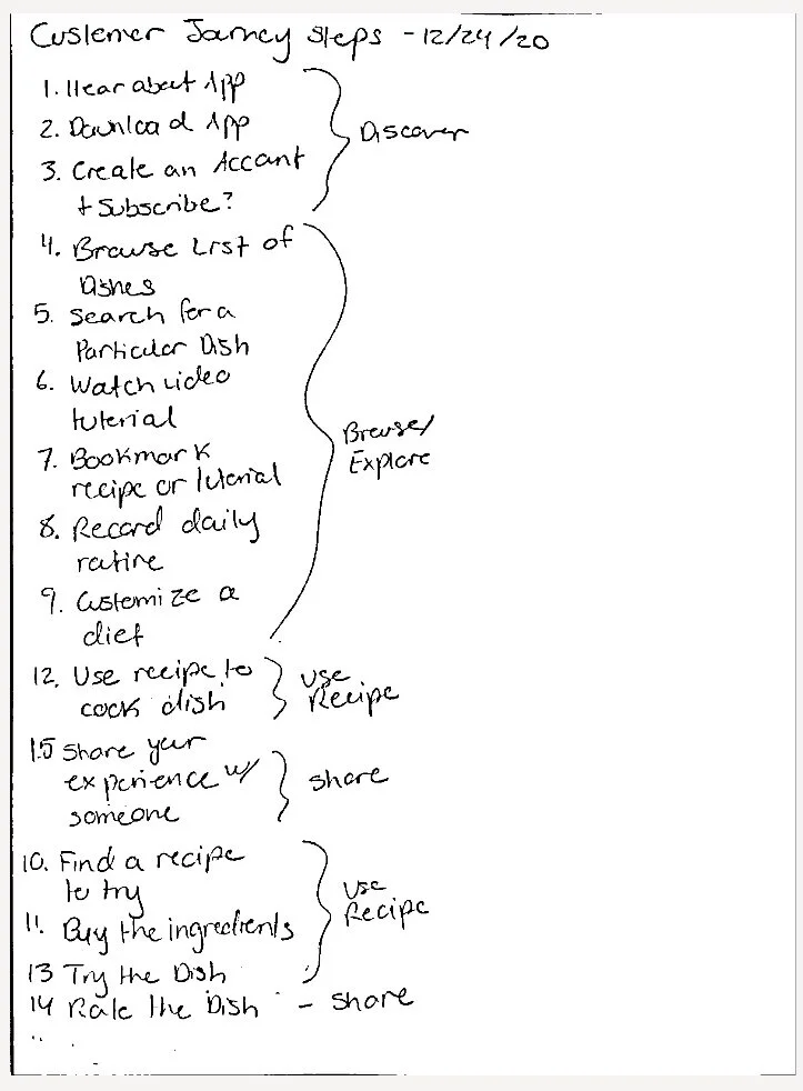
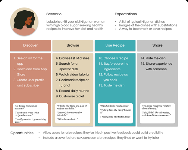
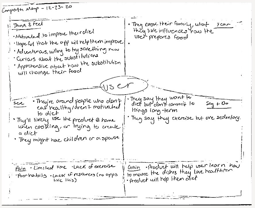
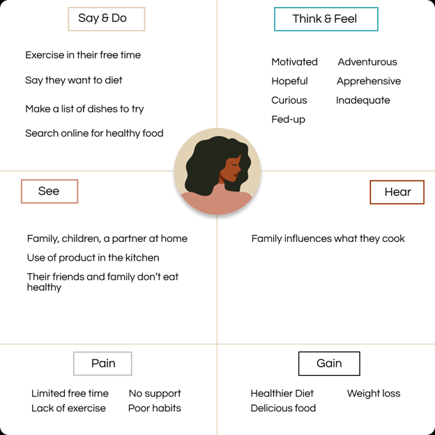
With the information I gathered from my client about the target audience, I wrote out my ideas for a user persona and used these to create Lolade. She is a 45 year old Nigerian woman and is a busy, working mother who typically prepares the meals she and her family eat daily. She struggles with high blood sugar and is seeking healthy Nigerian recipes to improve her diet and health that her family will also love. To gain an even deeper insight into the characteristics and needs of the target audience, I made an empathy map to communicate their experiences.
Information Architecture
User Flow
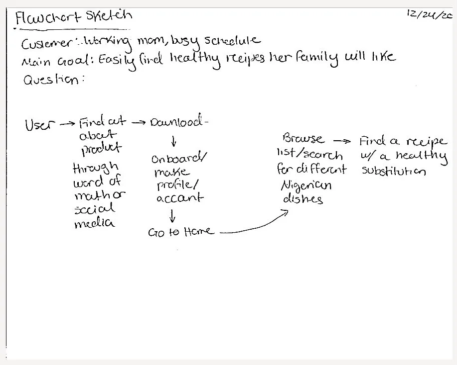
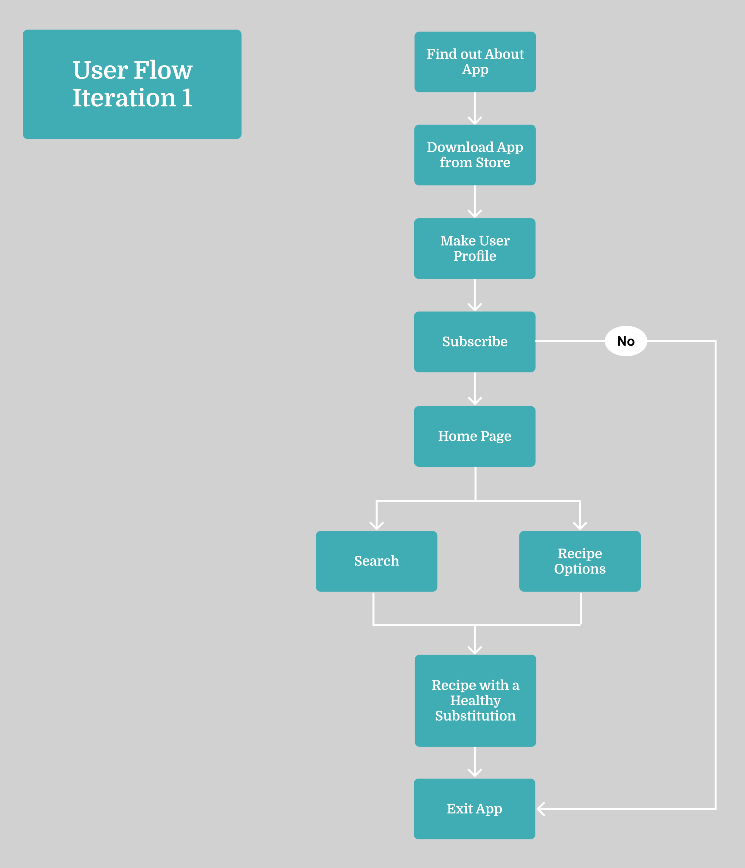
Using Lolade (the persona) as an example, I sketched out then created a digital user flow that communicates the path a user like her would likely take as they navigated the app. The client wanted to prioritize healthy Nigerian recipes as the main service offered in the product, and the user flow illustrates that users can do this by searching for recipes or selecting them from an easily browsable list of options.
Paper Prototyping
Before creating wireframes, I sketched out each page of the app first to map out the layout of the interface as a paper prototype. This was an easy and quick way to test how well my first design might look and work before making digital wireframes.


Clickable Lo-Fi Prototyping
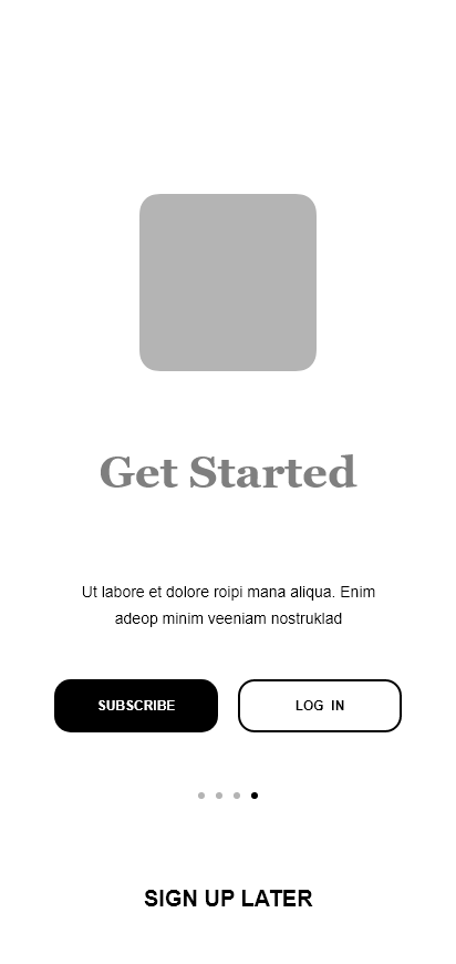
Using Adobe XD, I created a clickable, low-fidelity prototype. I added interactions, or gestures, that mimicked those that people use when interacting with a mobile app, like swiping/sliding between pages. I tested out the interactions several times by downloading Adobe XD onto my own mobile device and clicking through the prototype before finalizing it for testing.
Iteration 1 (Lo-Fi Wireframe)




Usability Testing
The goal of usability testing was to determine the following:
Will users understand the purpose of the of the “Notes” and “Create Diet” buttons in the navigation bar, or are those labels too ambiguous?
Is the the user flow of subscribing/logging in to the app intuitive?
Are there any improvements I can make regarding accessibility and information architecture?
What features were most important to users?
The first usability test interview revealed that the prototype was too low-fidelity - the participant couldn’t tell what they were looking at because there were no images or content. So, I added more realistic text on select pages as well as images for recipes to create a mid-fidelity prototype.
Iteration 2 (Mid-Fi Prototype)


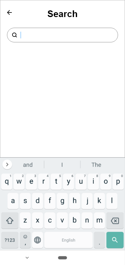


Using this second iteration of the prototype, I conducted the remaining four usability tests and gathered the following key findings from participants:
"Notes" is an ambiguous term, and participants had a wide range of assumptions about what they could use it for
Rethink the information architecture of the“Get Started” page so that the “Sign Up Later” button is more prominent/noticeable
Rethink the subscription functionality and information architecture
Edit the calendar in the “Notes” page and add a “Create Note” button
Consider adding the “Create Diet” feature to the onboarding - as you create an account, you can create a diet to get users to utilize the feature
Reconsider how the “Create Diet” could affect the recipes users see
Participants that did look at the “Create Diet” page (2 participants) wished there were more customization options
Participants said they wanted to avoid paying (i.e. subscribing) for the service. I should rethink subscriptions accesses/offerings, e.g. offering a free trial periodI should add some sort of confirmation after users choose a subscription plan so that they can avoid making an accidental purchase
Mood Board
Through usability testing, I learned how I could improve the app’s design for users in future iterations if I were to continue working on the project. At this stage, I decided to focus on creating a visual design that would appeal to the target audience. I created a mood board with typographical styling, an accessible color palette, images, and a potential logo.
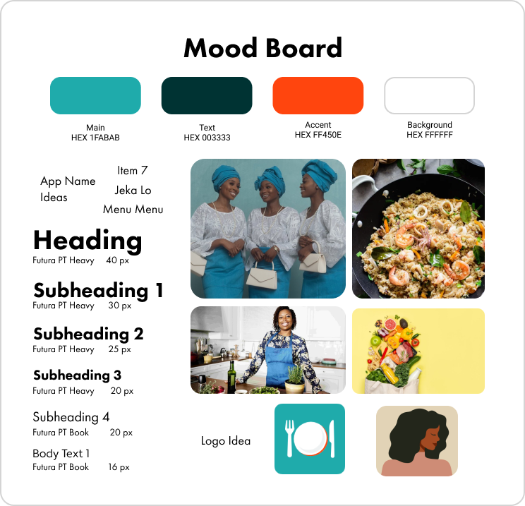
I understand the power of branding and how this can resonate with the target audience, so I took the time to consider what a fitting name for the product could be. I consulted family members on potential names that would be meaningful to Nigerian users, easy for non-Nigerian users to pronounce, and would convey the essence of the product as a food app.
My parents told me that in Nigerian culture, whenever someone hosts an event or throws a party, food is always seventh on the schedule, or as we refer to it, “item 7.” It was perfect, the most befitting name for a product meant to positively impact Nigerian women through food.
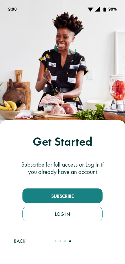
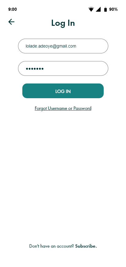
With all of this in mind, I finally had what I needed to create a final, more hi-fi mockup for Item 7.
Iteration 3 (Final Mockup)





Final Thoughts
When I presented my work and the deliverables to my client, she loved the design I came up with and the insights I had gathered. She’s even considering partnering with a developer and launching the application! During the design process, I did make the mistake of not including enough realistic content in the first iteration of my design - I think this might have impaired my ability to get the feedback I need in my first usability test. But I view this as a learning opportunity. I also learned how to create designs and prototypes using Adobe XD, which is an industry standard prototyping tool. My biggest takeaway from this experience is that it is perfectly okay and expected to take inspiration from other amazing designs and common UI patterns. Everyday, I’m becoming a better designer and this is just the beginning of my journey as a designer!