Ride It
Overview
Summary
My first project as a UI/UX designer was to design a mobile bus app for a fictional Midwestern transportation agency. I was given a project brief that included two business requirements, and I utilized the double-diamond design process to create Ride It.
Roles and Responsibilities
As a designer working for a fictional client, I assumed a variety of roles over the course of this project. I followed the double-diamond design process and began by conducting user research, which included creating a SWOT analysis in Google Sheets, writing a user survey in Google Forms, facilitating research interviews over Zoom, and then developing a user persona in Figma. I produced several user stories, a user flow, and a site map. Beginning with wireframe sketches, I iterated two low-fidelity mockups before creating a mood board and logo to add to a clickable prototype for qualitative usability testing. After arriving at a minimum viable product, I compiled my work and findings.
The Problem
Due to expansion, a fictional transportation company recently added several new bus routes, but riders can no longer tell if a bus arriving at a stop is theirs or not, with the most complaints being about the Washington and State bus stop. To solve this, the transportation agency wanted a mobile app that riders could use to tell when each bus would arrive at its stop and how much time they had before their bus arrived.
The Audience
The target audience consists of users living in Midwestern urban areas who ride the bus for public transportation.
My Solution
To solve the problem, I designed a mobile iOS app that allows users to view arrival times for each bus, including at the Washing and State bus stop. This information, in addition to a real-time bus tracking feature, gives users the ability to tell how much time they have to catch their bus before it arrives. Riders can also see the number of other riders waiting at a stop, how close to capacity their bus is before it arrives, and can choose to save information on the buses they ride regularly for quick access.
Discovery and Research
User Survey
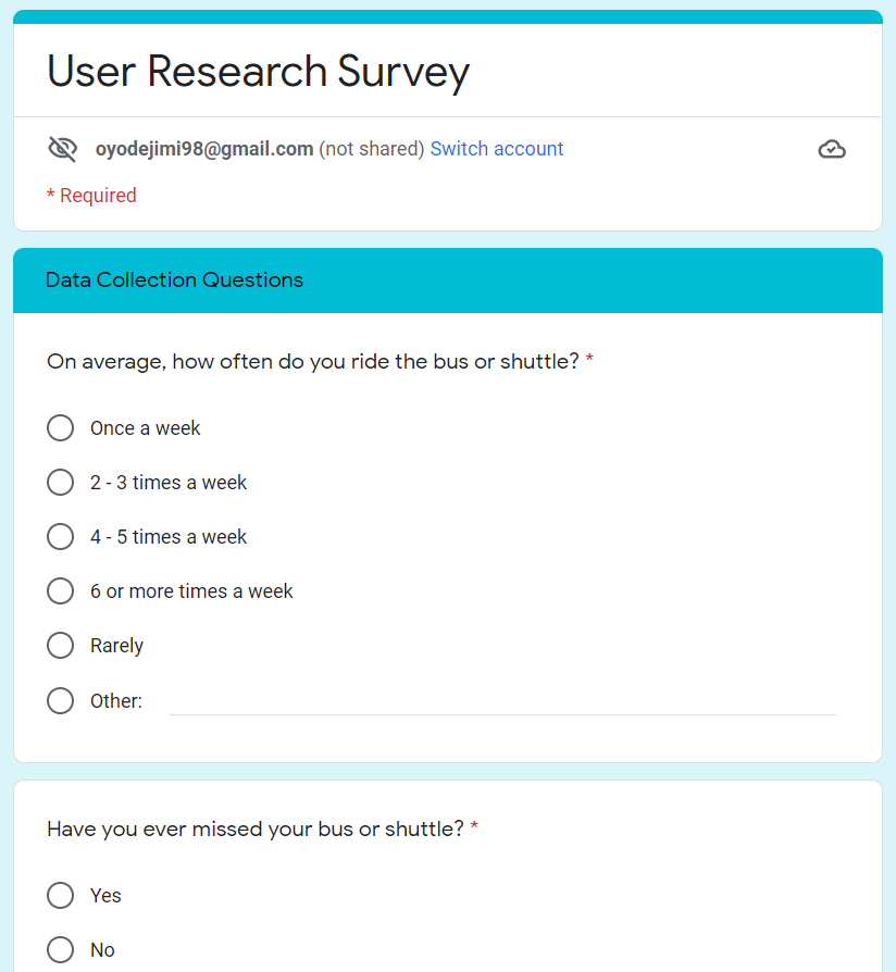
Using Google Forms, I developed a user research survey to gain insight about the types of users that might use my app and what experiences they’ve had trying to catch a bus. There were two categories of questions I asked that revealed users’ previous experiences trying to catch their bus as well as their demographics. These included pertinent questions like whether users had ever missed their bus before, what they currently do to keep track of their bus, and if they would even use a mobile app for tracking. I deployed my survey within student GroupMe chats at my university and to friends and garnered 51 responses. Of these, 29 people said they had ridden a bus or shuttle before, and from these responses, I learned the following:
18/29 (62%) would use a mobile app
24/29 (83%) are 18-24 years old
16/29 (55%) live in urban areas
22/29 (79%) find their bus schedule online/with an app
16/29 (55%) have missed their bus before
Competitive Analysis
As mentioned, part of my research included creating a competitive analysis, a method in which you research and compare products similar to yours that already exist in the market. For example, Google Maps, Citymapper, and Moovit are widely used and generally well-designed transportation apps that differentiate themselves from other similar products. I researched each of these as well as downloaded and used them myself. I analyzed these apps using Strengths, Weaknesses, Opportunities, and Threats, or SWOT, strategy to compare my competitors.
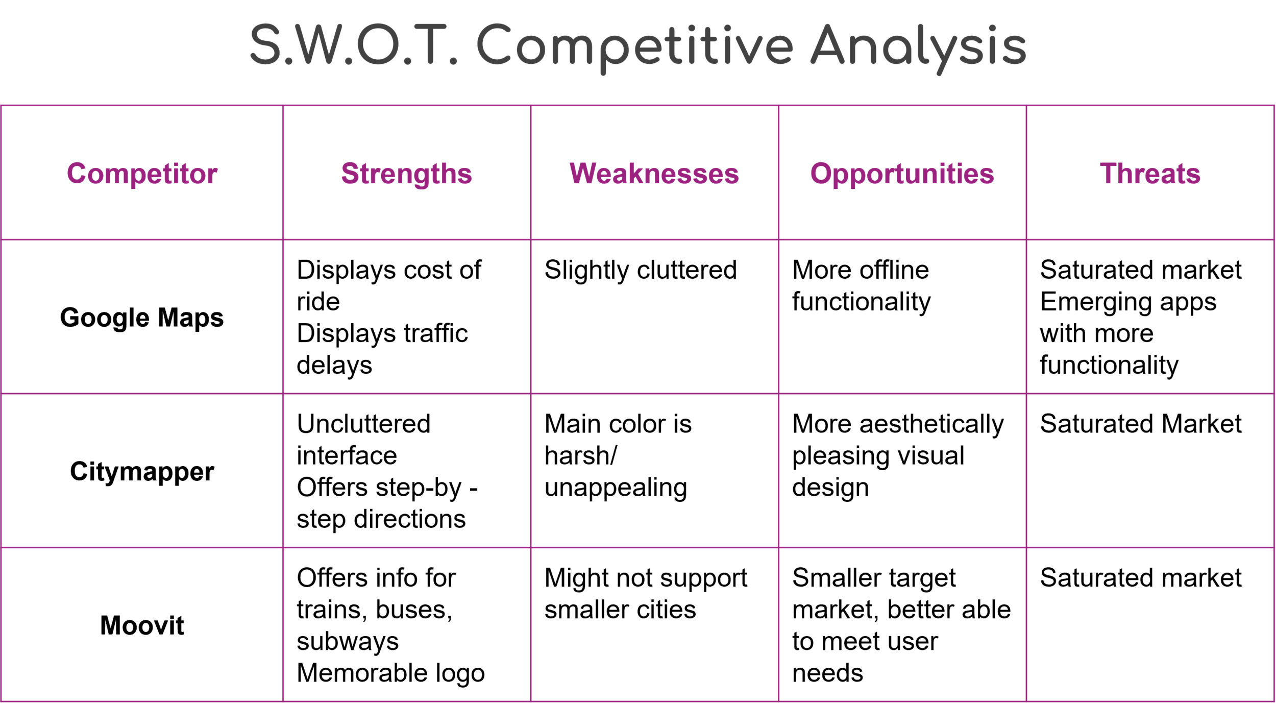
From this, I found that each has strengths that set them apart, from branding to information architecture to functionality. However, I also noticed weaknesses with each. For example, Citymapper’s choice to use bright green as its main color is a bit harsh to the eyes. Additionally, there are a multitude of public transit trackers available these days, so the market is saturated, and this can be a threat to the popularity of a product - if yours no longer satisfies or delights users, there are plenty of other apps users might turn to instead.
User Interviews
From this pool of survey respondents, I conducted 3 research interviews with participants that had all missed their bus before. I created a Google Doc which included my recruitment plan, the screening criteria for participants, and a consent form. I also made a session guide that outlined step-by-step instructions for the interview and the questions I wanted to ask to gain more information. I had participants tell me about their experiences catching their buses, if there was anything they found frustrating about this, and what they have done and what apps they’ve used to board a bus on time. The main findings are these:
Interviews primarily took the bus to get to/from their college campus
All have used mobile transportation apps to catch their bus on time
Main pain points: unknown arrival/departure time, crowded buses, no notifications for arrival/departure
User Persona
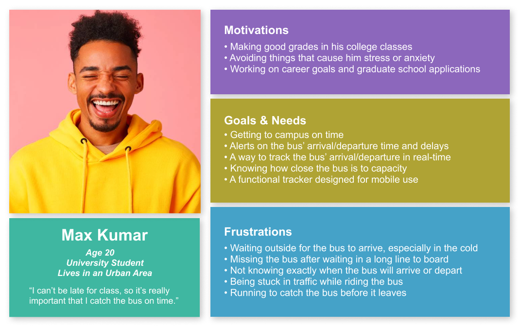
The last major deliverable of my research was a user persona I created using Figma. Using this research data, as well as information provided in the project brief, I developed Max Kumar, a college-aged undergraduate living in an urban area. I considered what Max’s motivations, goals and needs, and frustrations could be and how those relate to my app. Developing Max Kumar helped me personify my users and understand their current experiences in order to create the best transportation app for them. This was my final deliverable in the Discover phase.
Information Architecture
User Stories and Flows
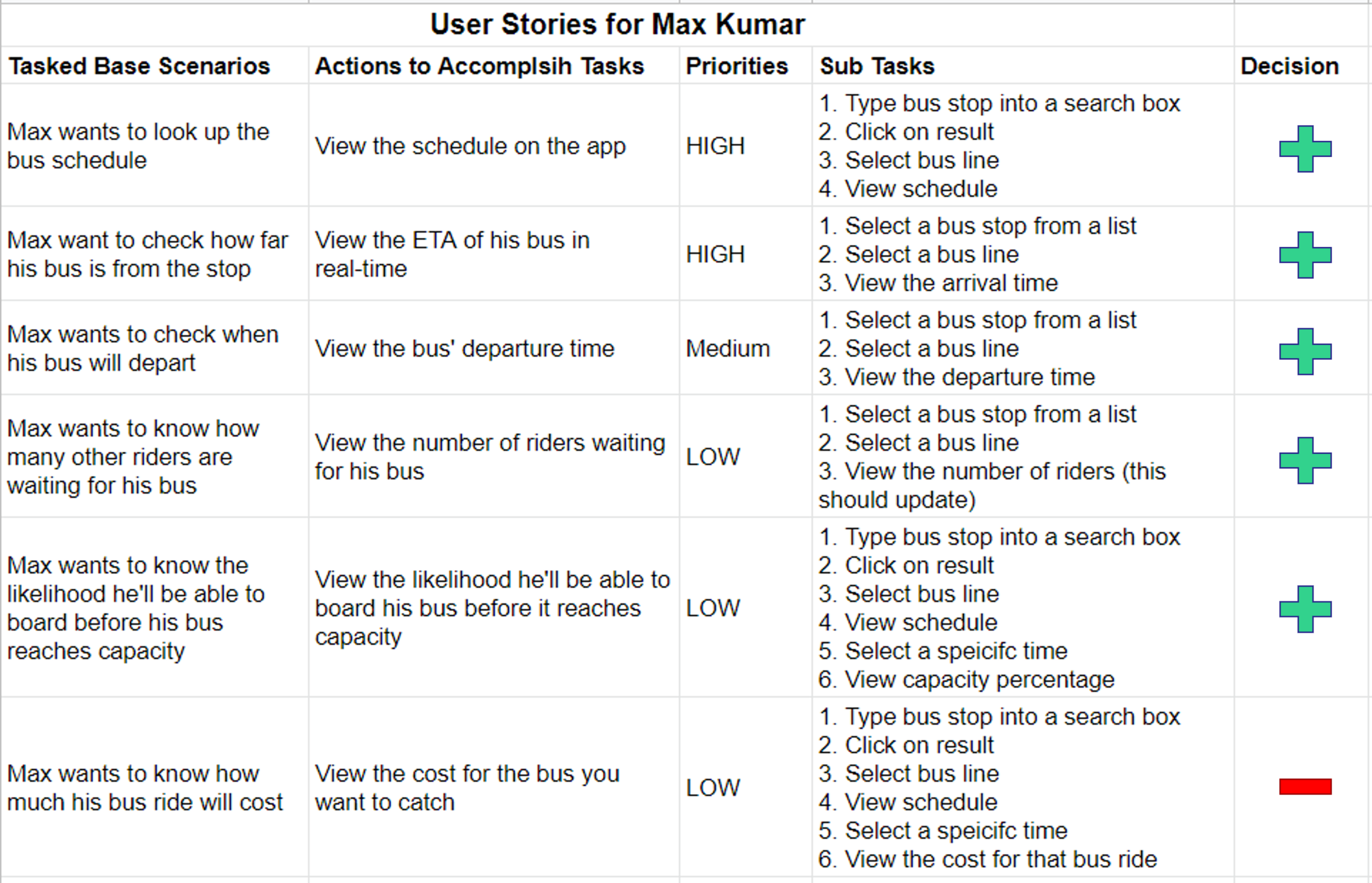
By determining who my users were and empathizing with them to understand their needs, I completed my user research and was ready to move on to the second phase of this design approach and define a solution. To do this, I started with creating user stories for Max Kumar, which describe who the user is, what they want, and why they want it. These tell a designer what the product’s features should be. Using the insights I gathered through research, I created six tasked based scenarios that also addressed the two problems presented in the project brief, and determined the actions necessary to accomplish those tasks. I then prioritized these tasks by how important they would likely be to users and by whether they met the business requirements - the first two stories directly related to the latter, so they received the highest priority. I then listed the subtasks that users would be required to complete in order to perform the original task in each story.
Lastly, decision-making is an important skill for any good designer, and I had to decide which of these user stories I wanted to further develop. The last story in the table was suggested outside of user research by a family member. Due to time constraints, I reasoned that adding the cost of the ride would be a useful feature to include if I had additional time to work on the product. But my main focus needed to be solving the client’s two main problems.
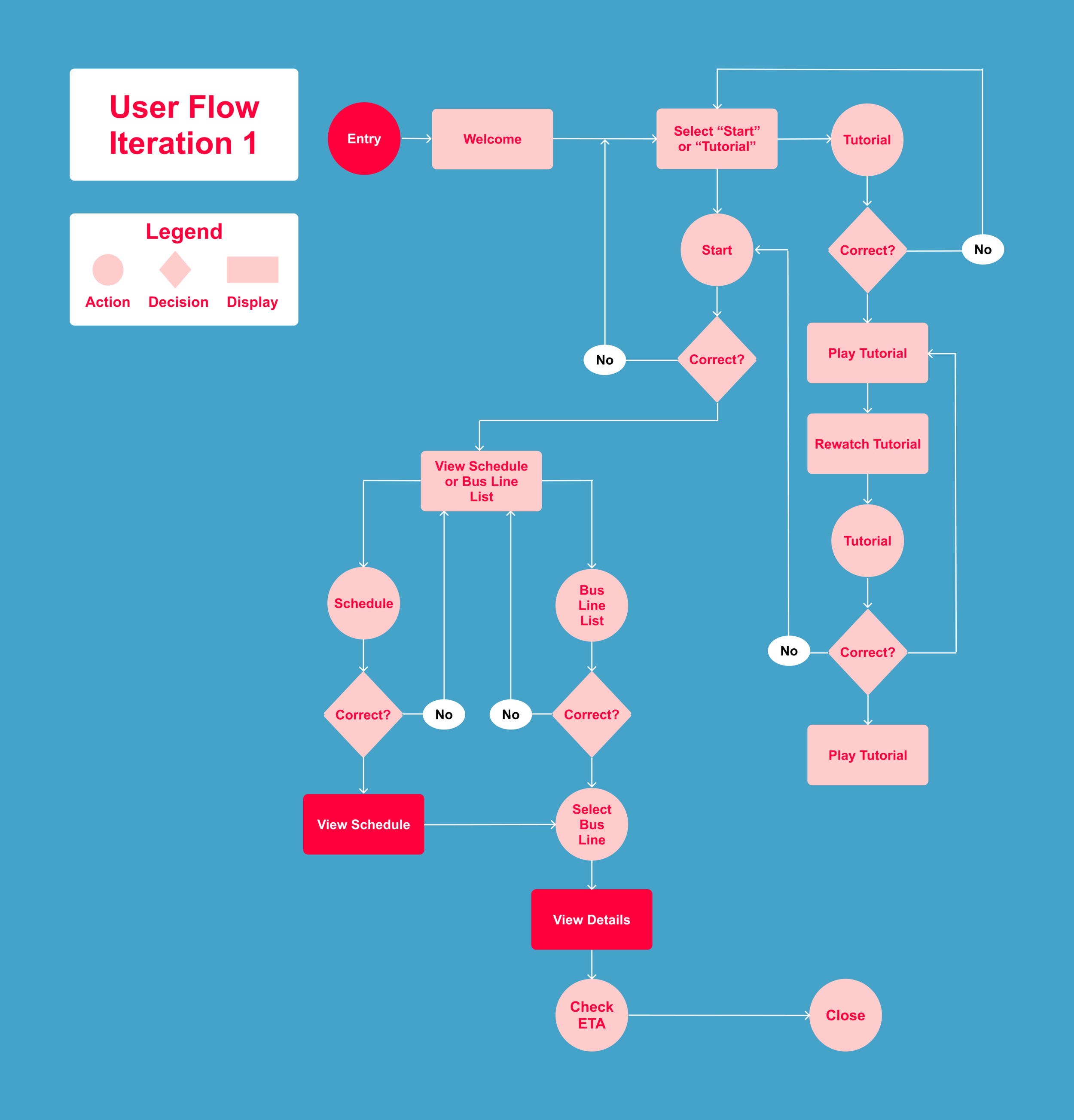
Having done this, my next step was to create a user flow that communicated the paths users would follow through my app to complete the overarching tasks listed in the user stories. I sketched out a first draft of the flow in a notebook, and then created a second draft that was more detailed and organized. From there, I used Figma to design the flow digitally, which included the actions users would take, the decisions they might make, and the displays they would see as they navigated my app.
Site Map
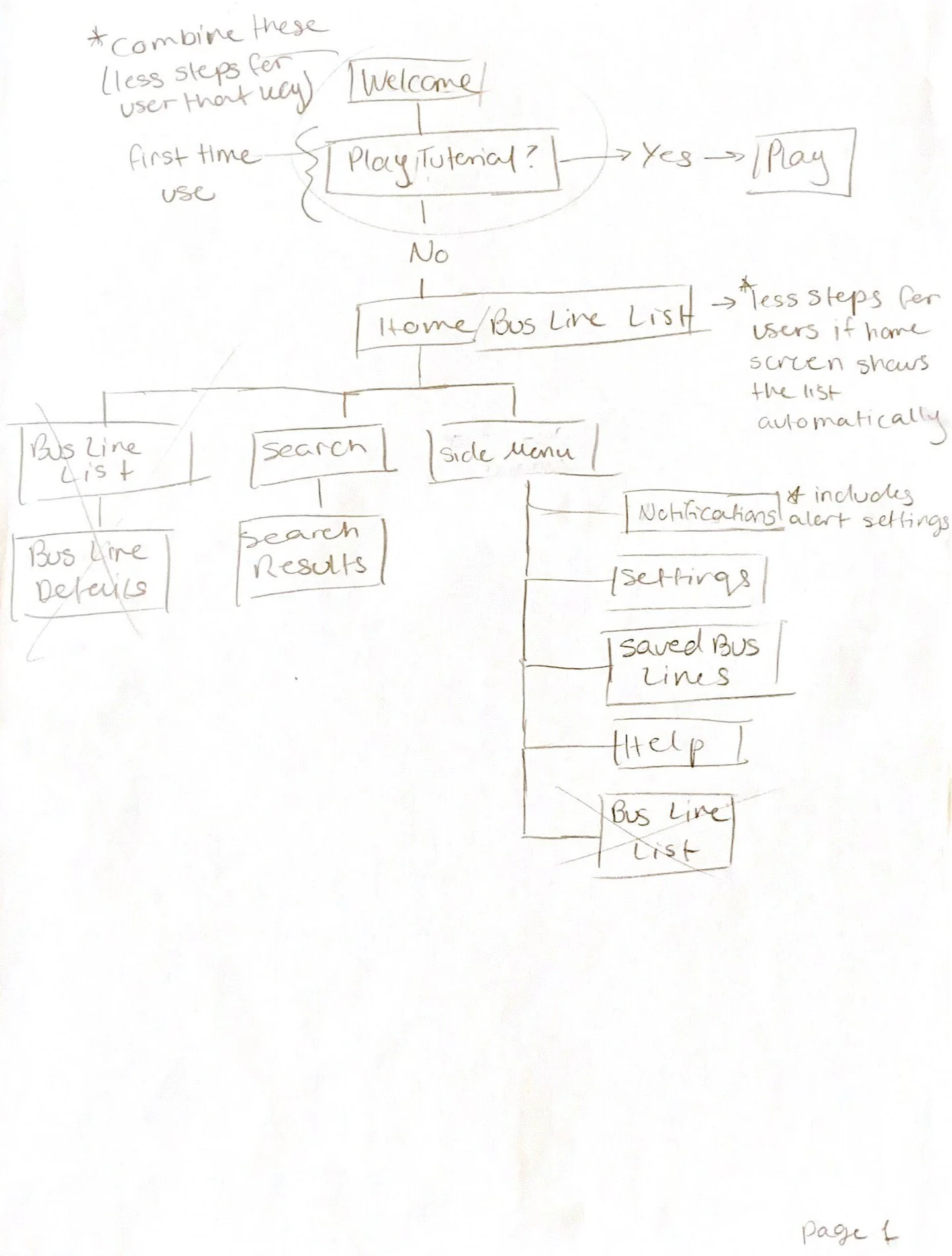
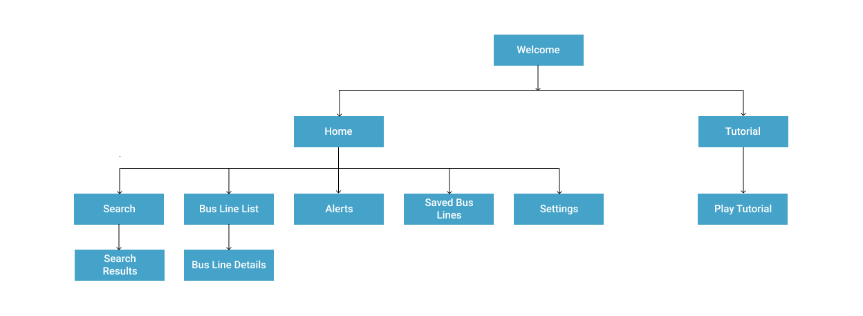
Similarly, I also needed to map out the app’s screens. To do this, I created a site map, which is a hierarchical diagram showing the structure of a website or application. From the welcome screen, users can either go straight to the home screen or view a tutorial for the app. If they choose the former, they can navigate to the different screens shown. The bus line list/home screen displays the arrival and departure times for each bus line (addressing the business requirements); alternatively, users can search for the bus line they want to view times for.
Wireframes
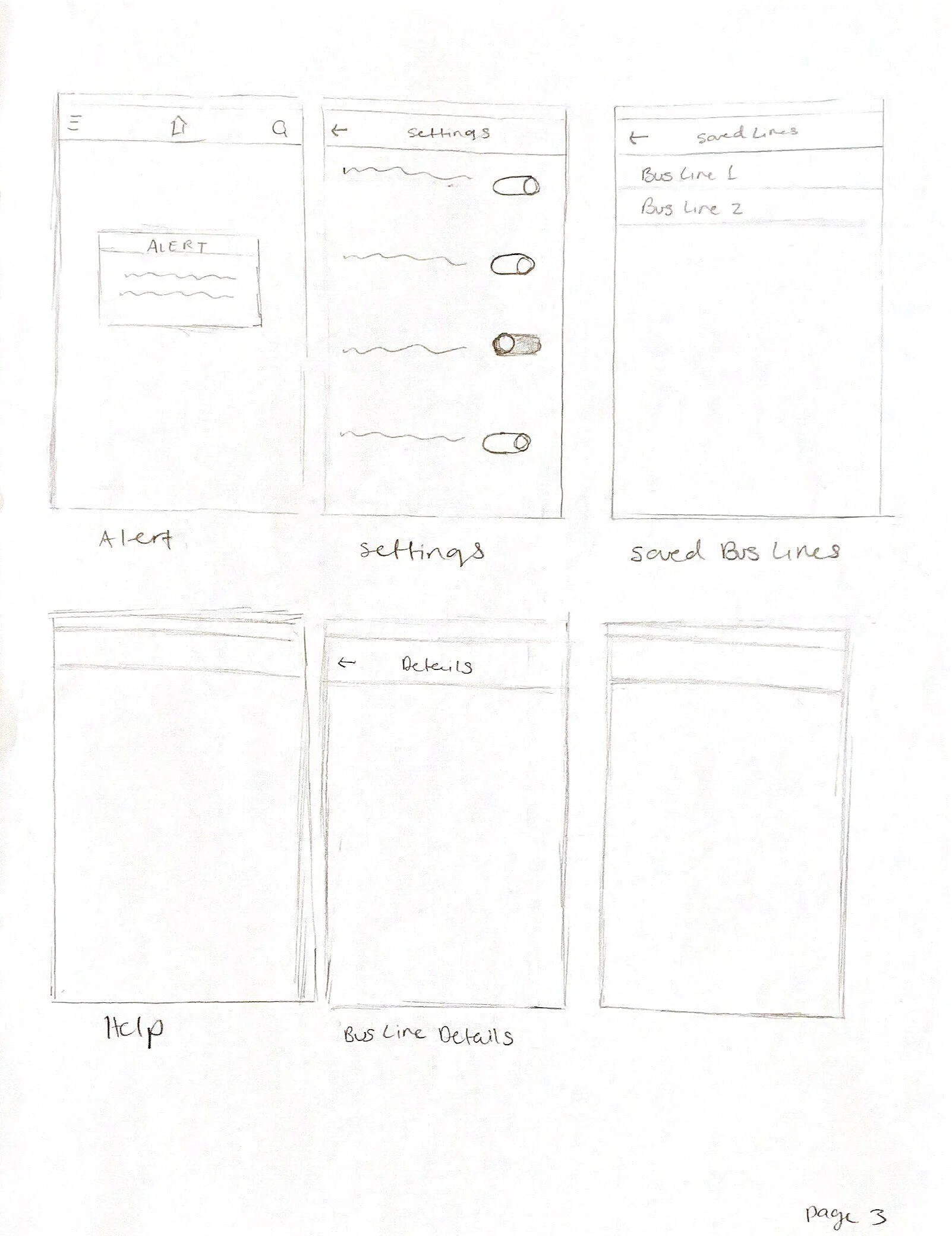
Now that I had a sitemap, I sketched out each screen to see what the layout might look like. Sketching out possible solutions first is much more cost and time effective than trying to create wireframes without having a plan for the information architecture. Doing this exercise essentially gave me the blueprints I needed to create wireframes.
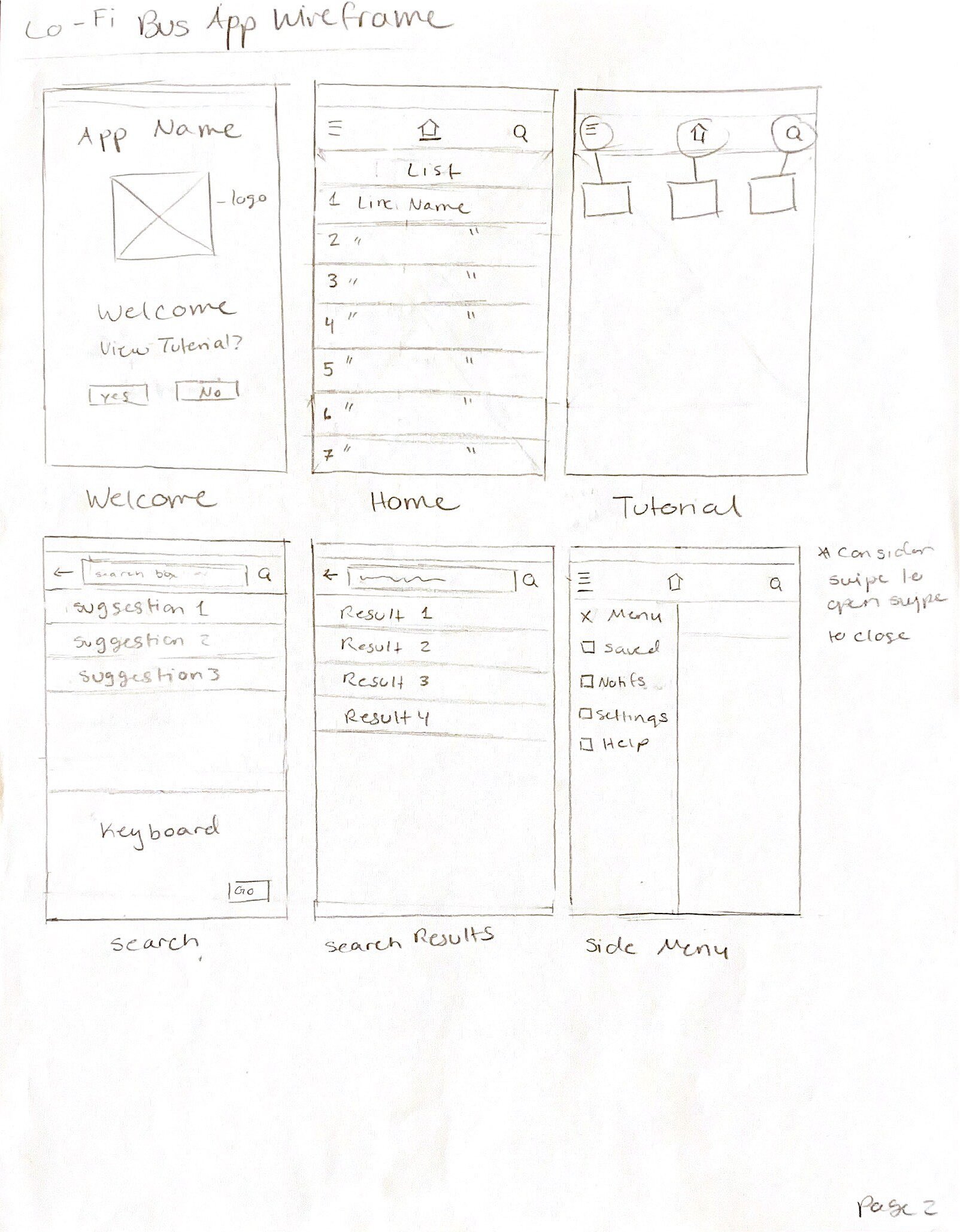
In order to bring those sketches to life, I used Figma to draft a first iteration of low-fidelity wireframes with an iPhone 11 Pro/X sized frame. Here, I recreated each of the screens in the sketch, as well the features I outlined in the user stories. I also utilized plugins and wireframe kits to add the icons in the navigation bar, the home indicator, status bar, and keyboard. I used a plugin to add the map to some of the screens as well to make the interface appear more realistic.
Iteration 1
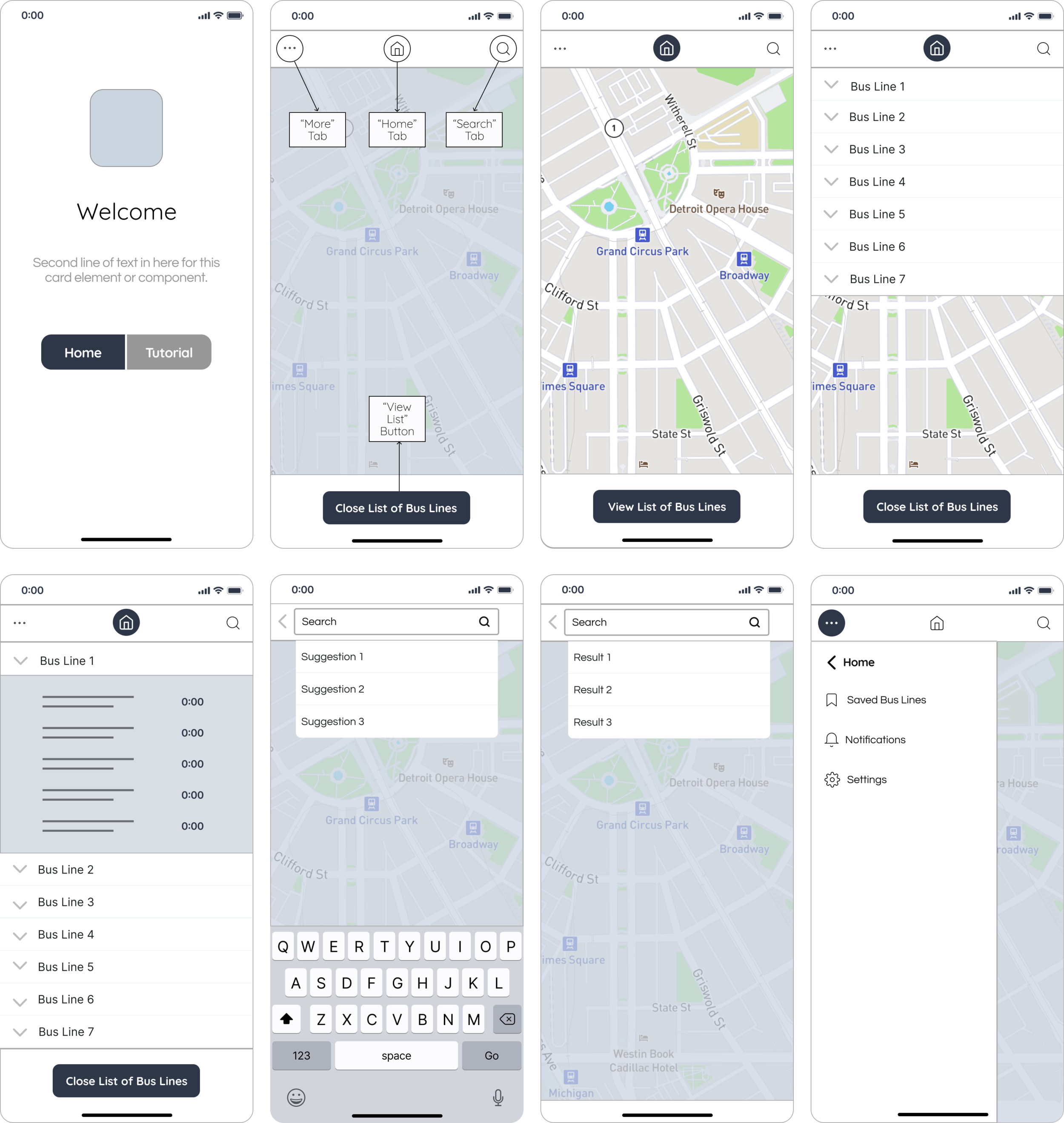
With iteration 1, I took the time and made the effort to create the best wireframe I could, but I knew that it would need further development if I wanted to arrive at the best product possible. So, I sought honest and constructive feedback from my Bloc design mentor about what I could do to improve the first wireframe. Their feedback included designing a more intuitive navigation and layout of the screens. Navigation bars in mobile apps are typically located towards the bottom of the screen for ergonomics and usability. While speaking with my mentor, I also had the idea to create a “Saved” screen so that users like Max, who need a quick and easy way to view bus times, could save information for buses they ride frequently instead of having to search through the app every time they use it. I created iteration 2 to include these changes.
Iteration 2
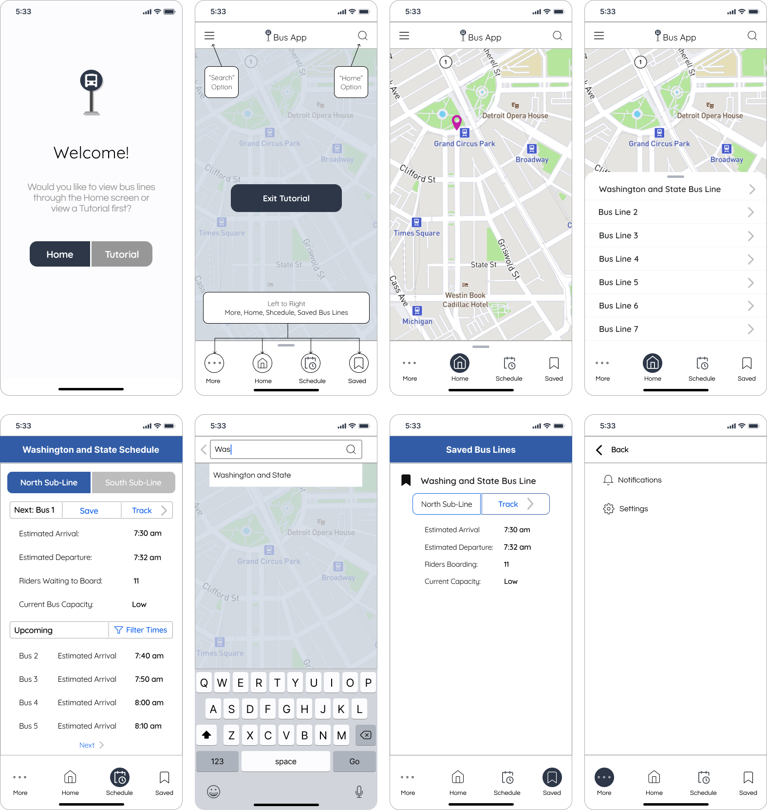
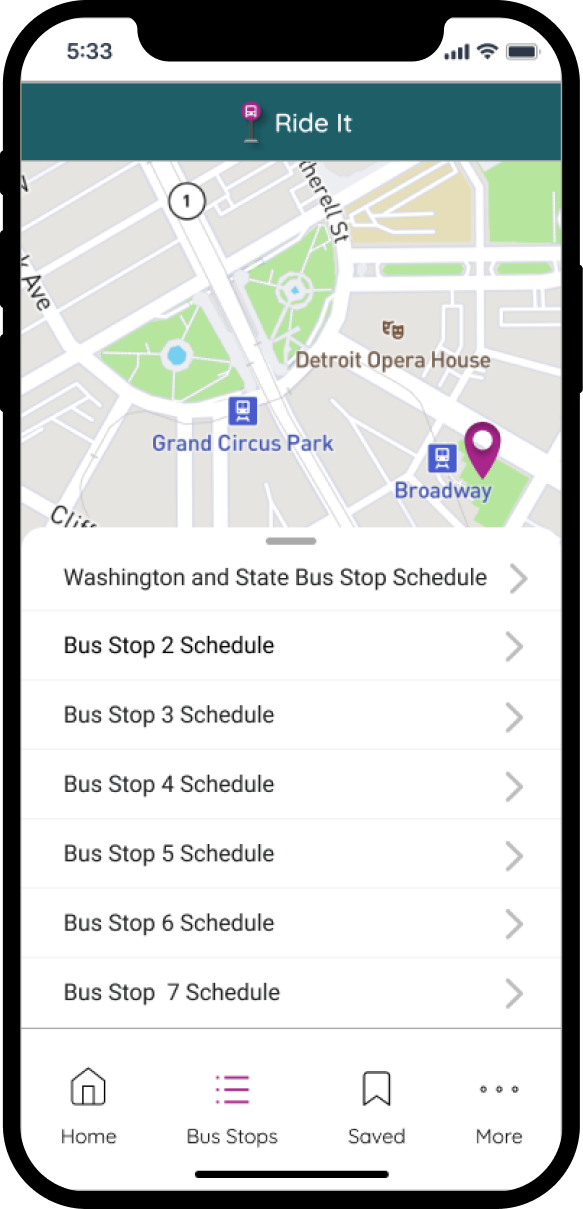
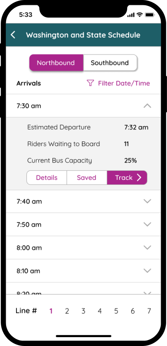
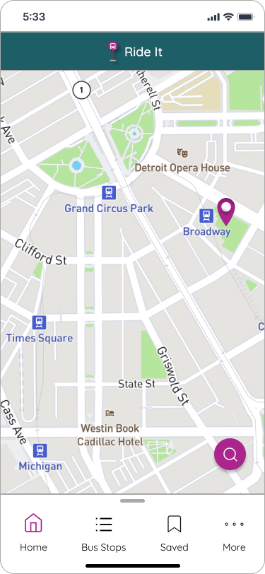
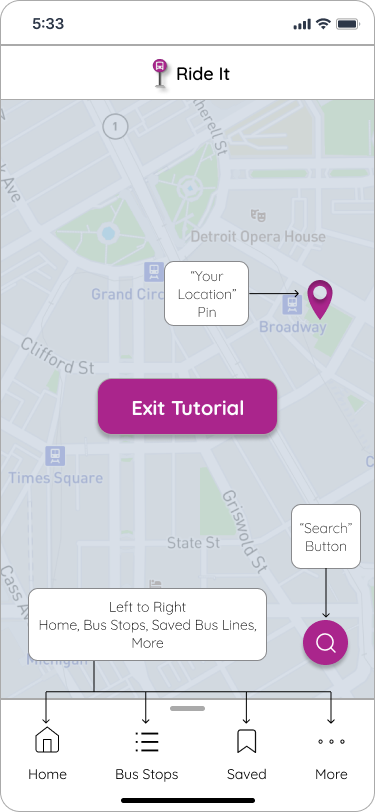
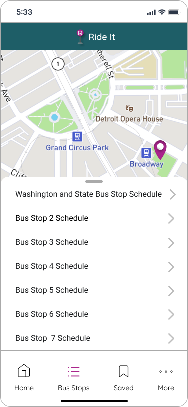
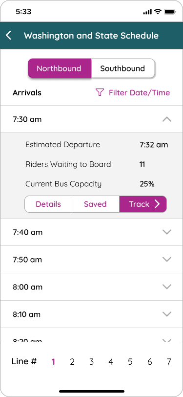
For this mockup, the schedule screen displays more information for each arrival time, such as departure time, capacity level, and number of riders waiting to board. Users can also select which route they are riding in order to see the buses and times for that direction. They can filter times so that they don’t have to scroll through a long list of arrival times, as well. On this screen, users click the “Save” button to add specific buses and times to the “Saved” screen. They can also click “Track,” which would navigate them to the map, so they could track the bus they want to ride in real-time. I moved the bus line list towards the bottom of the screen, and added an indicator to let users know that they can swipe the list up to view it and down to close it. The “More” screen is extended to the full width of the screen, which is more common than half the width of the screen. Additionally, I added a pin icon on the map to show the user’s location.
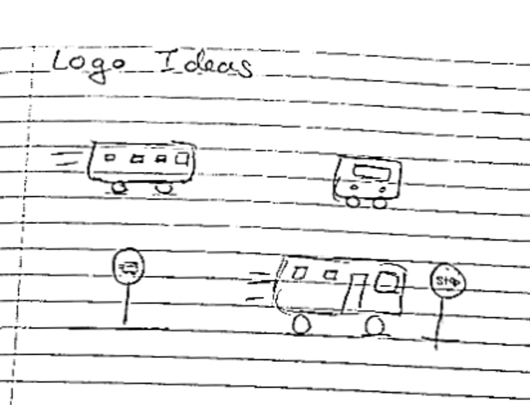
There is also a logo on the first screen, which I first sketched out a few ideas for before choosing one and editing an icon I added using a plugin to recreate it.
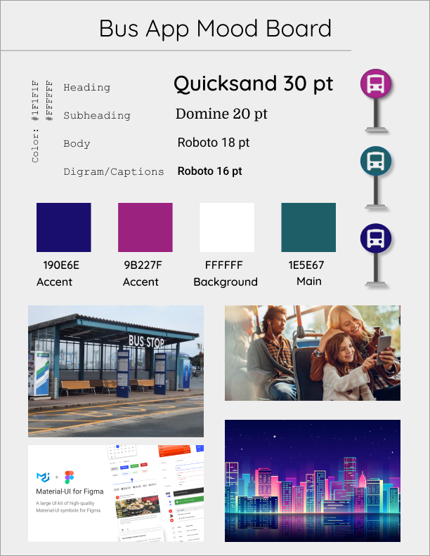
The other primary deliverable I produced in this stage was a mood board to capture the essence of the product’s brand through imagery, colors, typography, and other visual elements. I chose Quicksand because it is a sans-serif typeface, which is typically easier for most people and the visually impaired to read than serif. I arranged the type in a hierarchical format to communicate the importance of different groups of text on each screen in the app.
To maximize readability, I chose to maintain the white background and selected black for the text, which meets the contrast requirements outlined in the Web Content Accessibility Guidelines. To ensure this, I used an online tool called WebAIM. For inspiration for the color palette, I found mages online that related to the look and feel I wanted the app to have.
Finally, I arrived at the Deliver stage, which involved implementing my solution and developing high-fidelity prototypes to test it. The first thing I did in this stage was to implement the visual styling I considered and finalized in the mood board.
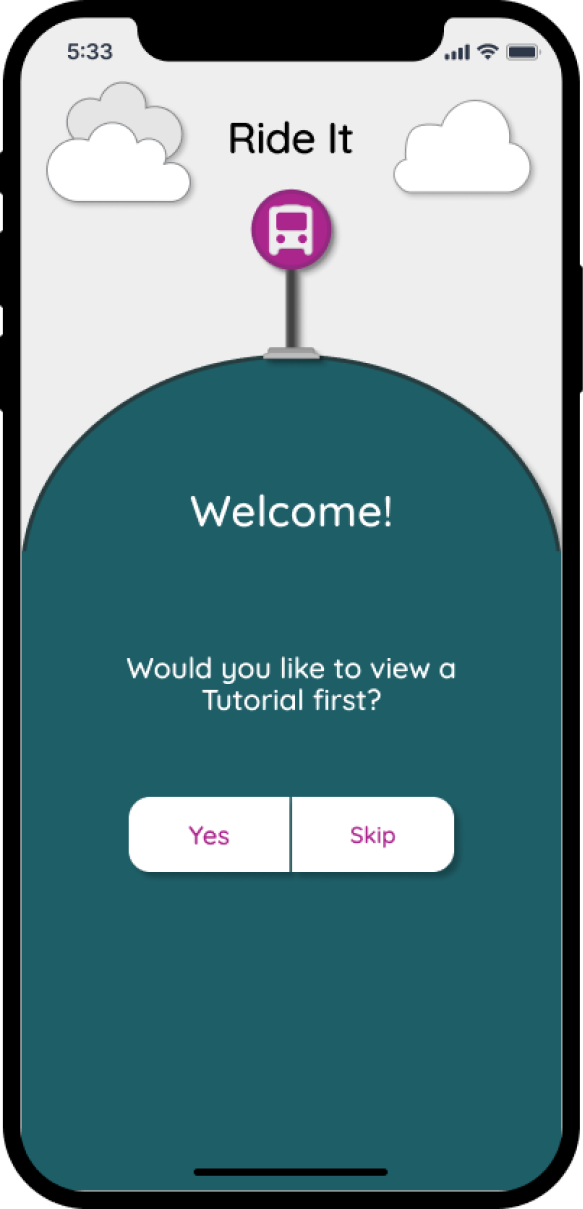
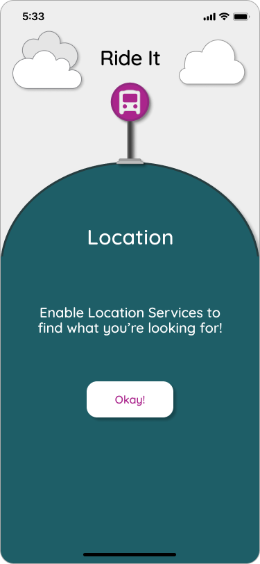
I also added a screen that serves as an example of how the app’s alerts appear on the “Home” screen, as well the actual app icon. I thought about the “Welcome” screen and decided its layout was uninteresting. I wanted the branding to be more unique and eye catching because this is the first screen users see when opening the app. After experimenting with shapes and icons in Figma, I designed the “Welcome” screen to mimic an illustration, such as by adding a shadow effect to the cloud icons to give the illusion of motion. I also added a “Location” screen, because after exploring similar apps like Citymapper, I realized that users would have to enable location services in order to use the tracking and location pin features.
Iteration 3
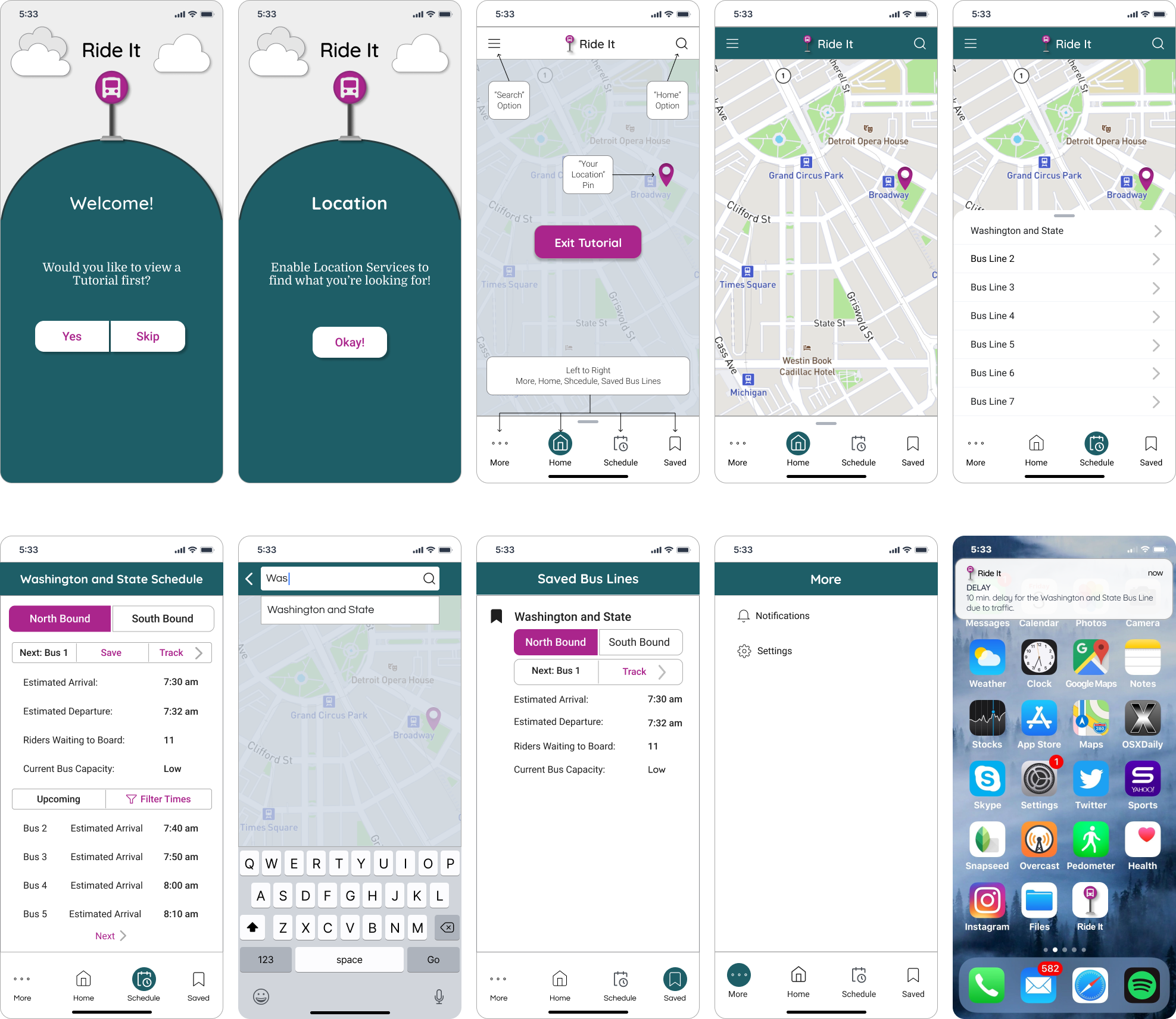
To validate the changes I made from iteration 2 to iteration 3, I conducted qualitative usability testing, which is meant to collect data on the functionality and usability of the product. I recruited two people to complete the usability tests. I came up with a list of scenarios and tasks for the participants, then created a clickable prototype of iteration 3 in Figma, which allows participants to click through the mockup as if they’re clicking through the actual app itself. The benefit of this type of testing is that it helped me gauge the ease of use of my app and where I could make changes that would improve the experience for the user.
There were 3 main takeaways I gathered from the results of the tests and the feedback I received from participants:
The “More” and “Hamburger Menu” buttons were redundant and therefore confusing
The information architecture of the “Saved” and “Washington and State Schedule” screens were unclear and the labeling of some buttons (e.g. Next: Bus 1) was too ambiguous
The “Saved” screen needed to reflect the likelihood that users would ride multiple buses in a week and would therefore want to save more than one
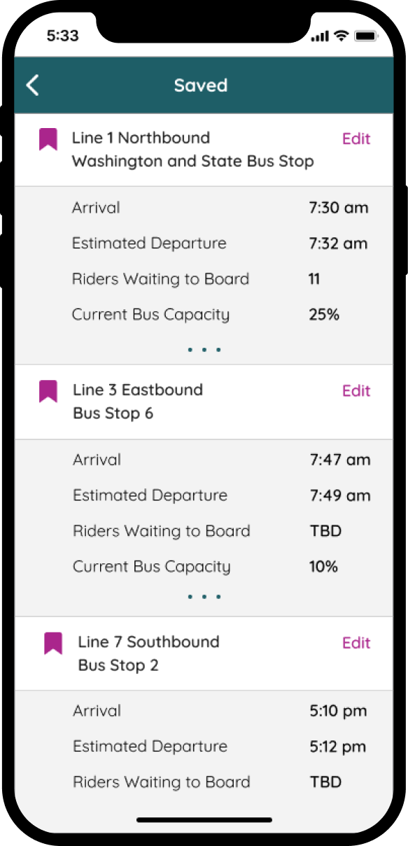
These were the primary issues I corrected in my final iteration and minimum viable product. For additional features, users can now see how many riders will be waiting to board an oncoming bus for a specific bus line. Riders can also view how close to capacity the bus is, which is displayed as a percentage. This way, users can judge the likelihood of whether they’ll be able to board a particular bus at a given time. There is one additional feature that is out of scope, and this is the ability for users to save a bus to a Saved screen, in which they’ll be able to see information like arrival time, departure time, riders waiting, and capacity for a specific bus at a specific time.
This is useful in scenarios in which a rider takes the same bus at the same time multiple times a week and they simply want to check when exactly their bus will arrive without having to search for that information or check the bus line list repeatedly. Lastly, I noticed an error regarding phrasing. In the project brief, it’s stated that the “Washington and State” bus stop that has 7 lines. I misinterpreted this and thought there were 7 lines and that “Washington and State” was one of them. I addressed the mistake by changing the wording of the bus line list. Overall, I met the requirements of the project brief and completed my first mobile app design.
Iteration 4 (Final Mockup)



Final Thoughts and Reflections
This was my first project as UI/UX designer, and I learned a lot from the experience. I discovered how crucial it is to develop a well-thought out low-fidelity wireframe so that you don’t have to go back and reorganize the layout of the elements and content while also trying to make visual design changes. I also learned to name assets as I create them for organizational purposes and to think critically about the user flow and how users will be able to accomplish tasks with my designs. I was a bit hesitant to research other similar products because I didn’t want to base my design off of another one, but I learned that in UI/UX design, it’s acceptable and expected to take inspiration from similar products. I did struggle a bit not to lose sight of the project brief and requirements as I generated more ideas for Ride It. To avoid this in the future, I think it’s helpful to regularly check whether the decisions I’ve made align with the requirements for the project. Overall, I had a lot of fun designing Ride It and I’m incredibly proud of my first UI design!