
MeetU
Overview
Summary
As a college student, I love being involved on campus and meeting other students, however this can be incredibly challenging for a variety of reasons. But with MeetU, it’s easier than ever for students to connect on campus! MeetU is a website that allows you to find out what events are happening on campus, see what student organizations your college has to offer, and join niche student group chats.
Roles and Responsibilities
For this project, I took on the role of a solo UX Researcher, UI/UX Designer, Visual Designer, and Project Manager to complete the following deliverables:
UX requirements, a user survey, a competitive analysis, user stories, user personas, user flows, user interviews, usability tests
Wireframe sketches, lo-fi digital wireframes
Mood board with typefaces and fonts, a color palette, and a logo
Hi-fi mockup, clickable prototype
Throughout the design process, I used the following tools and resources:
Figma
Zoom
Google Forms, Sheets, Docs
Color Contrast Analyzer, WebAIM
Canva Fonts
Coolors
Material.io
Unsplash
Tailor Brands Logo Design
The Problem
In college, students often have a difficult time:
Meeting other students
Figuring out what events are happening on campus
Joining group chats for clubs, events, and classes to chat with other students
As a designer, I sought to alleviate these issues by creating a unique and easy to use digital product.
Target Audience
Ideal users are college undergraduate or graduate students who are 18-25 years old and looking to meet and chat with other students at their college or attend on-campus events.
My Solution
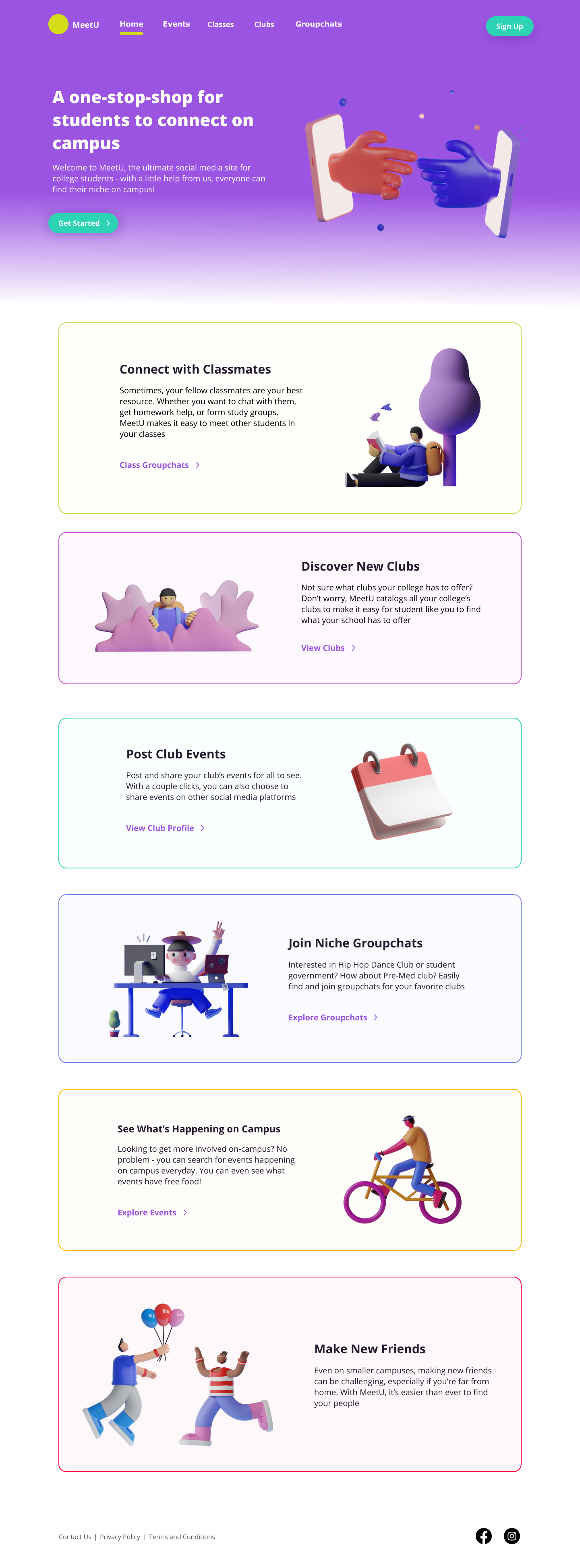
I created a website that acts as a one-stop-shop for students to connect on campus. Due to time constraints, I focused on designing 3 pages:
Landing Page: offers an overview of the website and the options to sign up or login
Events Page: where users can browse through all of the on-campus events posted by clubs; users can also view suggested events by adding filters
Groupchats Page: users can search for and view chats relating to clubs, classes, or events; a “your chats” panel also displays the group chats they’ve joined
Discovery and Research
User Survey
To gather insights on how college students currently connect with other students and get involved on campus, I created a user survey and shared it with friends and in Bloc/Thinkful’s Slack channels. I crafted the survey’s questions with the intention of determining how students hear about events, how student organizations promote themselves and their events, and how students communicate with/meet other students. From their responses, I found that digitally, students primarily heard about events through social media and group chats. I also learned that they primarily used Instagram, Facebook, or GroupMe to meet or communicate with other students online.

User Survey
Competitive Analysis
Using this information, I created a SWOT competitive analysis to assess the strengths and weaknesses of these services as well as potential opportunities for and threats to their growth.
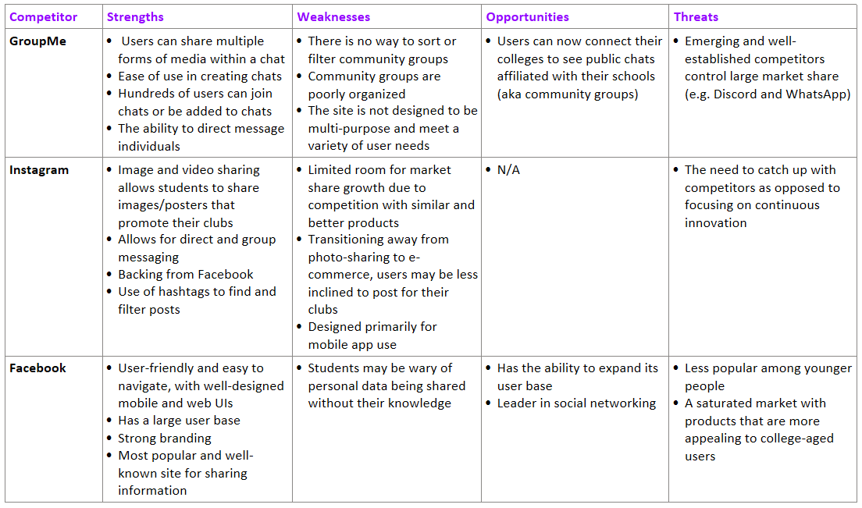
Competitive Analysis
User Personas
I recruited 4 survey respondents for user interviews to gain a deeper insight into the behaviors, needs, and user pain points of my target audience. I developed a session guide, interview script, interview questions, and consent form. From these interviews, I created 3 fictional characters that represent the types of users who would find MeetU useful.

User Persona 1 - Andrea Ramos

User Persona 2 - Jai Singh
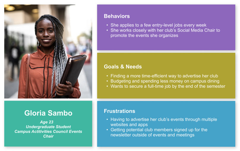
User Persona 3 - Gloria Sambo
Information Architecture
User Stories
Next, I wrote 7 user stories with scenarios in which users would find the product useful and the types of tasks they would seek to accomplish. I prioritized the user stories that aligned closest with the original concept I had for the website (finding events and joining niche group chats to communicate with and meet other students). The plus signs indicate which stories I wanted to reference as I developed wireframes and the minus signs are assigned to the stories I chose to revisit for future iterations of the product.

User Stories
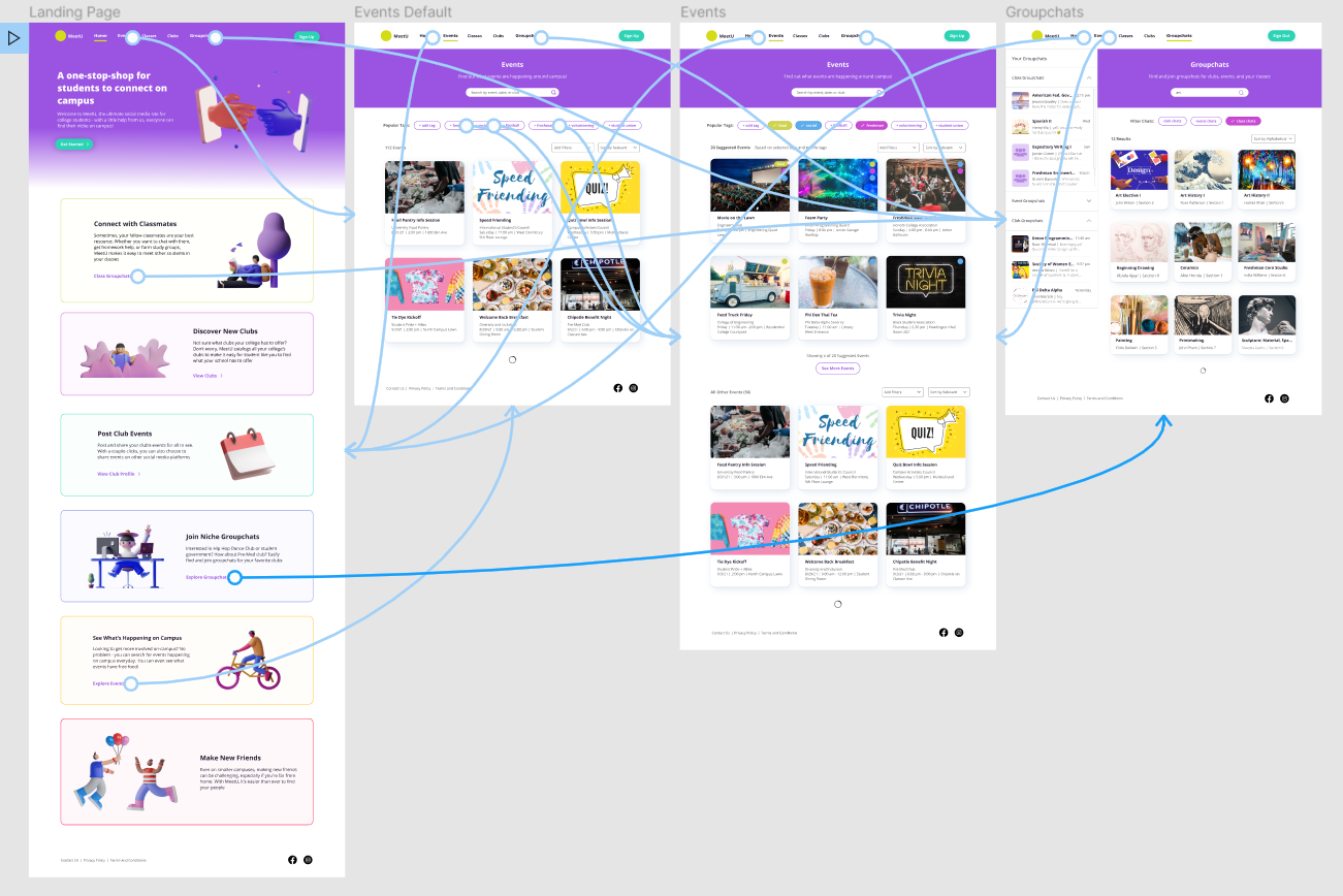
User Flows
With these user stories in mind, I considered how users might navigate through the pages of the website to accomplish these tasks. I thought about how individuals like Gloria would go about browsing and viewing the events their club posted. Or what it would look like if Jai wanted to browse through group chats and join one for a class. And for users like Andrea, I wanted to develop a flow that would allow them to see event details and perks, like free food.


Wireframes
Having outlined my user flows, I had what I needed to sketch out wireframes, but I was unsure what viewport would be best to design for. I did some research and through a 2015 study conducted on behalf of Pearson, I discovered that 88% of college students used their laptop on typical day in contrast with 85% of college students using a phone. Based on this, I chose to design a web/desktop interface to meet user needs.
On the Landing page, I sketched out where the hero message and image would be located as well as a call-to-action button for users to create an account. For the Events page, I sketched a screen that could also be used for the Clubs page - the same search and filter option functionalities would be available to users on both screens, therefore I made their layouts identical for simplicity. I was also interested in giving users additional options for finding what they’re looking for, so I sketched tags to help users refine results. Moreover, I sketched “add filter” and “sort by” dropdowns. Taking inspiration from the information architecture of GroupMe’s desktop web interface, I sketched a side panel on the Groupchats page that displays which group chats users have already joined. Using these sketches, I created digital wireframes in Figma.

Iteration 1 (Lo-Fi Wireframes)


Brand Development
With completed wireframes, I next considered how to create a distinctive brand that aligned with the experience of using the product. Some of the happiest memories I have from being college were when I was hanging out with my friends, exploring campus and my college town, and trying new things outside of my comfort zone. I wanted to translate the way I felt in these moments into a brand that other college students could relate to, starting with a name for the website. The product’s main purpose is to offer students the ability to connect with other students on campus through various means, and my first thought was to name the site ConnectU. As catchy as this was, the idea was already taken, so I thought of words or phrases that conveyed a similar meaning and chose MeetU. The name is concise, easy to understand, represents the product, and hints at the target audience (the “U” is short for university).

Logo Sketches
Additionally, colleges and universities often use simple but memorable branding, and their logos often simply consist of the school’s initials. Taking inspiration from this, I sketched out a handful of ideas for how to pair or combine the M and U in MeetU. To avoid being mistaken for other brands or confusion, I chose to further develop sketch two.
For the color palette, I researched color psychology and selected the following colors based on how they could represent the brand as well as what they could potentially make users feel:
yellow (happiness)
turquoise (clarity)
purple (imagination)
To avoid the eye strain caused by pure black text on a white background, I shaded the purple hue and used this color for text. I also used WebAIM and Color Contrast Analyzer to check that the foreground colors, background colors, and font used throughout the website met WCAG AA guidelines for accessibility. My initial color choices did not, so I adjusted them through adding shade until they met accessibility standards.
As for typographical choices, I wanted to select a typeface that followed UI standards for websites. For the navigation bar and body text, I chose to use Verdana, which is a sans-serif (i.e. easy to read), web-safe, HTML font and likely to be pre-installed on most operating systems. For headers and subheaders, I selected Open Sans Hebrew, which is a popular and commonly used Google typeface.
Lastly, I created a text hierarchy to communicate varying levels of importance through size, typeface, and font. I added all of these visual styling choices to a mood board and added stock images that illustrated the types of experiences or lifestyle I imagined users could have by using MeetU.

Mood Board
Using the mood board, I created mockup v1 of the website and added images from Unsplash and 3D illustrations from a Figma kit. I then added interactions to different elements on the pages to create a clickable prototype for usability testing.
Iteration 2 (Mockup v1)


Prototype
Through testing, I wanted to gather feedback on the following:
Do users understand how to add tags on the Events page?
Would users prefer to add tags, add filters, or use the search?
Do users enjoy the aesthetics of the website?
Is the site easy to use and navigable?
Would users find this website useful and create an account in real life?
I developed scenarios and tasks with the goal of answering these questions, then facilitated 4 usability tests over Zoom. I asked participants to share their screens and think aloud as they navigated the prototype. I recorded my observations and their comments and asked them some follow-up questions when their tests had concluded. From these interviews, I transcribed all of the responses I received and summarized my key findings:
Users liked and preferred to use search on the Events page
But users are unlikely to click “add new tag”
Users found the aesthetics of the site friendly and cheerful
But the connecting hands illustration on the Landing page did not match the brand identity
There should be an option to login on the Landing page next to the “Sign Up” button
Redundant information on the Landing page should be removed or condensed
Users loved the concept and would use the website in real life
Especially if they were freshman
Final Mockup
Using the the conclusions listed above from usability testing, I refined mockup 1 and iterated a final prototype with the following improvements:
Landing Page:
I removed the redundant descriptions
I added a “Login” button next to the “Sign Up” call to action button
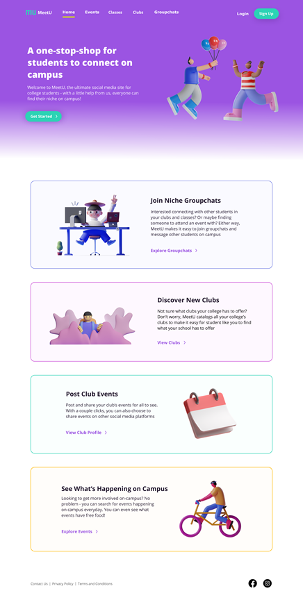
I replaced the hands illustration with two smiling people interacting, which better communicated MeetU’s brand as a site for building connections among college students
Events Page:
Since users likely wouldn’t interact heavily with adding tags, I redesigned the default layout of the Events page with tags located under the “Add Filters” dropdown and removed the “Suggested Events” text and associated elements and content
I created an Events page that displays what users would see if tags are selected, and these would appear underneath the “Suggested Events” text
All Pages:
I added the logo to each page of the website
Iteration 3 (Final Prototype)


Final Thoughts
Overall, I successfully designed multiple pages for MeetU over the course of four months. As a member of the target audience, I sometimes found it challenging not to let my assumptions about users and their needs guide me. To overcome this, I constantly reminded myself that I needed to let my research drive my decision making and the result of this is a product that users would really enjoy. If I were to continue developing the website as more than a concept, I would revisit the users stories I didn’t pursue and refine the design to address those scenarios. Finally, of all the feedback I received from usability testing, hearing that users were delighted by the visual aesthetics of MeetU made me feel amazing as a visual designer. I loved that I was able to explore the intersection of function and beauty with MeetU and I’m excited to continue growing my skills as a designer!