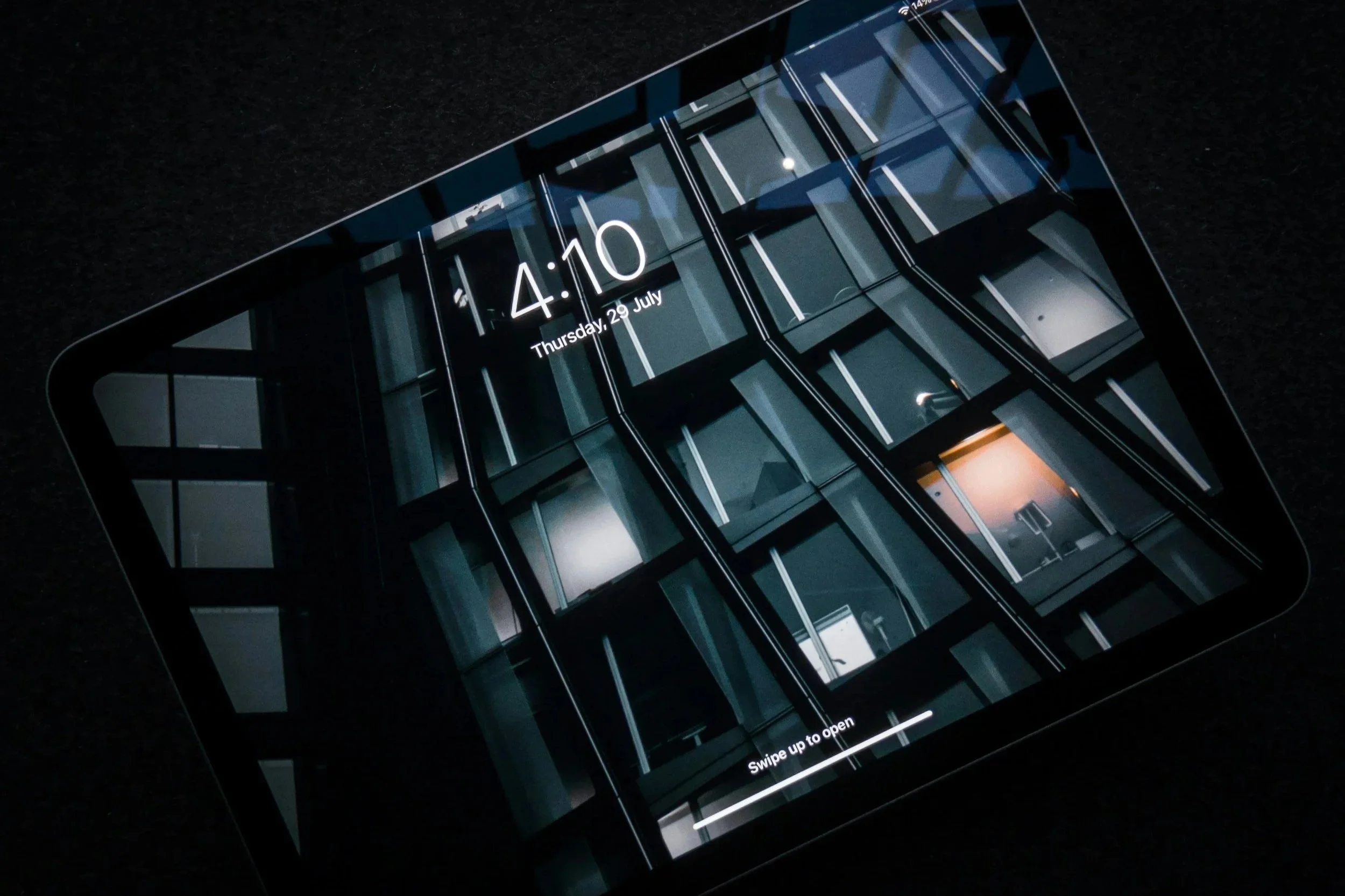
Tablet Interface for Machine Control
A solution driven by users at every stage.
This is an Enterprise Design project. Due to confidentiality policies at General Motors (GM), I am only able to share limited details about applications I have designed.
OVERVIEW
BACKGROUND
Our Partners
A team of engineers at GM designed and built a machine that meets a unique need within the automotive industry - the simulation of vehicles, from performance cars to cargo vans.
The Ask
To control this complex property, design new, user-friendly desktop and tablet experiences that allow users to send data to and retrieve data from this machine. Desktop app must incorporate virtual reality (VR).
ROLE
Sole Researcher: Conducted user research, gathered and presented findings to stakeholders.
Lead Designer: Led the design effort as the only designer assigned to the project. Collaborated cross-functionally with Engineers, Developers, and Enterprise Designers (Visual, Content, Product).
TIMING
April - July 2025
Original timing set by stakeholders was April to June - due to the complexity of the problem and the volume of work required, we negotiated an additional month for design.
DISCOVERY
ONBOARDING
A fundamental stage in Enterprise design is understanding the current state of the project - this involved kick-off meetings and presentations with our stakeholder partners.
MACHINE DEMO .
From there, I was given a demonstration of the machine and the existing desktop widget and Android tablet app that were used to control the machine. VR interaction is integral to the desktop experience but not included on tablet.
APP EXPLORATION & DOCUMENTATION
I explored the design and functionality of the desktop widget and tablet app and documented what I saw in the event that I’d need to refer to the previous designs in future.
DETERMINING NEXT STEPS
I had a working understanding of the machine and the products that controlled it, but I needed to know more about users - their roles, workflows, and what capabilities they needed.
USER RESEARCH PLANNING
Using stakeholder recommendations, I recruited participants that would utilize the machine and the apps once launched. I then created a research plan and interview guide.
CONDUCTING RESEARCH
2 week duration | Contextual inquiry involving a user demonstration
5 participants in Human Factors, Human Interface Design, Digital Experience Studio, Advanced Vehicle Development, Architectural Framing Studio
KEY FINDINGS + TAKEAWAYS
Many users will utilize the machine in leadership reviews to influence decision making, so tablet device is preferable over desktop due to portability, ease of use (does not require VR interaction), and higher user confidence.
Since timing is limited, prioritize delivering tablet app designs before desktop.
Labeling in the existing tablet application was not clear enough - some labels were difficult to differentiate at a glance, they’re too similar. Additionally, certain terms were familiar to some users but unfamiliar to others, which caused confusion.
From this, I recognized that we could not rely on labels alone to convey meaning to users, we would have to create clarity by providing supplemental information to explain labels.
Users liked the simplicity of the current tablet app, but wanted more functionality and better ease of use - fewer clicks, error prevention, and quicker data input.
I’d have to design a solution that would be inherently complex without users noticing that complexity - essentially, make the experience robust but easy to use/learn.
PRESENTING RECOMMENDATIONS
I took the findings and takeaways I gathered and presented the study to my manager and engineering partners. We discussed my recommendations and prioritized (must have, could have, or won’t have) for version 1.
Given that multiple users had stated that they would prefer the tablet app without reliance on VR, my partners and I agreed that I would first design and deliver the new tablet app.
I now understood what users would need out of my solution, but there was a major roadblock to my design process:
My stakeholder partners did not provide written requirements.
This was despite numerous requests from me over through the discovery phase. Without this information, how would I know exactly what my partners expected me to build? It almost felt like navigating a sea without a map.
But I couldn’t afford to delay product design. So, I gathered any requirements that had come up in meetings and communication with them. And, perhaps more importantly, I had so many valuable insights and recommendations from research that would guide my design. I decided
Users would be my compass.
PRODUCT DESIGN
BRAINSTORMING
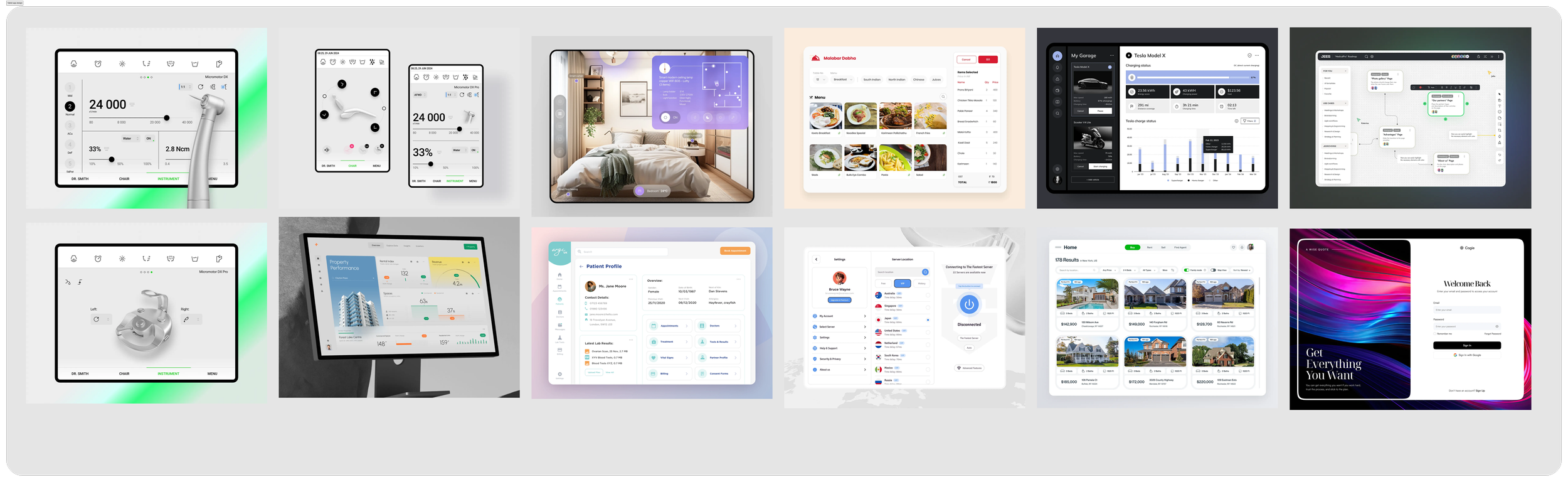
I found tablet app designs to take inspiration from, sketched initial ideas, and reviewing design patterns established by the Enterprise Design team, and created user flows.
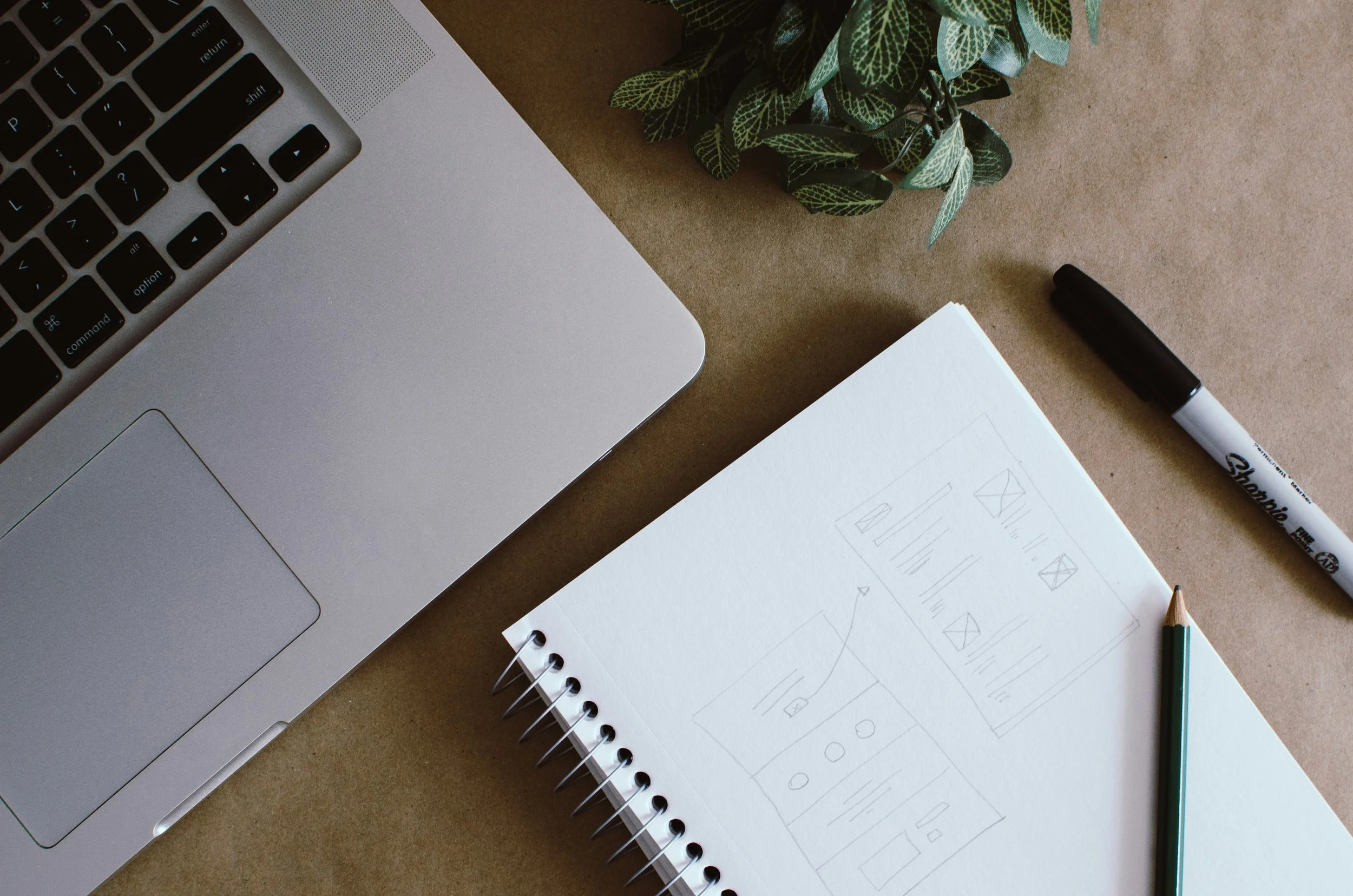
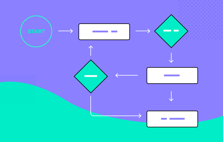
WIREFRAMING
Sketches and inspiration turned into low fidelity wireframes in Figma. Weekly brainstorming sessions with my team and touchpoints with my partners led to frequent feedback and continuous iteration throughout this phase.
DESIGN CONSIDERATIONS
Prior to this project, I had never designed a tablet application and knew that I needed to research design considerations necessary for this type of mobile experience. Here are few:
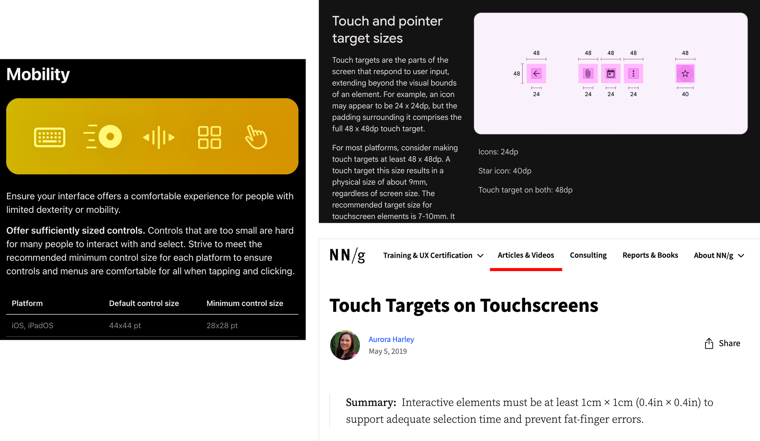
Touch targets: determining 48px x 48px min. touch target size using Apple, Material. and NNG guidance
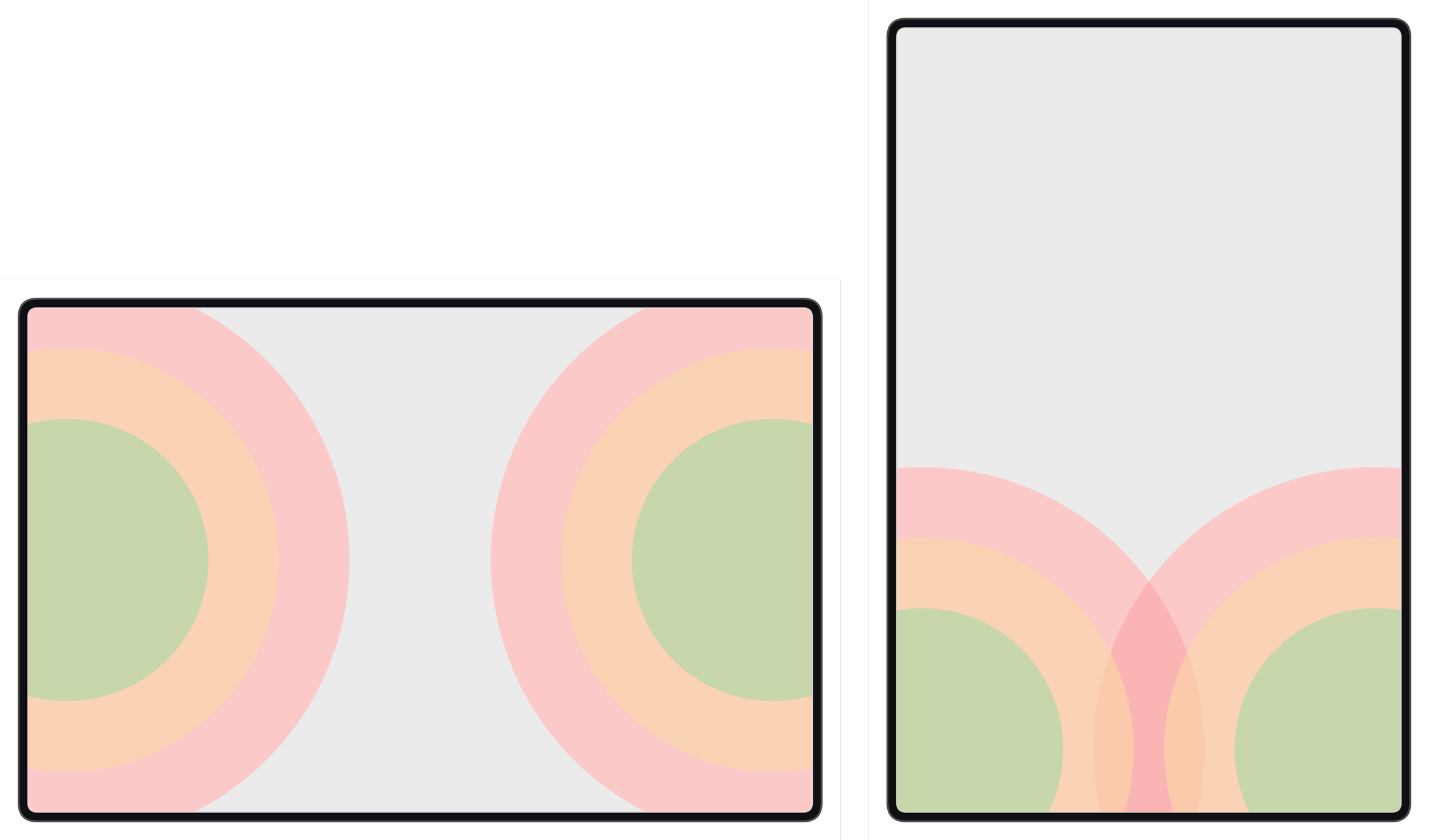
Reachability and ergonomics: being cognizant of users’ ease of reach when interacting with screen elements
Keyboard obscuration: when keyboard is triggered, ensuring relevant content is still visible
FINALIZING FEATURES + MVP
Although I had forged ahead without a finalized set of features from our partners, I knew the lack of direction was not sustainable and would lead to missed expectations. Additionally, our software team joined the partnership towards the end of the discovery phase, so we were unaware of what software limitations that might constrain design.
With that in mind, I worked with my manager to create a feature list, shared this with our partners, and scheduled two sessions to review and come to agreement on what would and wouldn’t be part of the MVP for the tablet app.
While I can’t discuss the specific features of the application here, I can share that my partners and I decided that the app would be designed for iPad Pro 11in. in landscape orientation.
MORE WIREFRAMING
Now that I finally a map to follow (in the form of my feature list), I continued to evolve the early wireframes and prototypes I had created.
TESTING, REFINEMENT, AND REVIEWS
QUALITATIVE USABILITY TESTING
About one month into product design, I had a Figma prototype built that ready for user testing. The Enterprise Foundations team had not yet had the bandwidth to provide visual styling input so I couldn’t collect user feedback in that regard. However, I was able to test: Navigation, Task Completion, Ergonomics, Information Architecture, Copy, and User Attitudes
From testing, I learned the following and more:
Users had difficulty orienting themselves in the app because multiple pages used a similar layout
Users are likely to hold the iPad with their left hand and interact with their right hand
Users want to be alerted immediately when their input is invalid rather than after sending data to the machine
Some labeling in the app is still confusing, users recommended other nomenclature
Some users found layout of the primary input page unintuitive, this required discussion with partners
Users had difficulty tapping on a particular component, indicating that a larger touch target is needed
REFINEMENT
These as well as the other insights I gathered were invaluable feedback - I knew what improvements were absolutely needed and which ones necessitated further exploration, consideration, and discussion with my partners. As I worked on improving the overall design as well flows and components, I was also able to loop our visual and content designers for support.
VISUAL AND CONTENT DESIGN
Post testing, our foundations team was able to review and provide feedback on visual styling for the app. Using their guidance, I applied the design changes to the mockups and prototypes, elevating them from low to high fidelity.
At this time, I also began working with a content designer newly assigned to the project. I gave her an overview of the problem, the work I had done, and which specific areas of copy users had trouble with in testing. We collaborated on writing recommendations and I made updates throughout the app.
REVIEWS
Reviews with my boss, my boss’s boss, her boss, and his boss…
In Enterprise Design, projects are almost always presented to leaders all the way up to our VP or executive director. Work is first review with my manager multiple times a week, and then my senior manager when at regular intervals. Once designs are well developed, they are presented during Enterprise Design critiques in which I primarily receive feedback from my senior manager and secondarily from my peers in the department.
The work is further refined before coming to my Director. Once he has seen the designs and shared his thoughts, I again iterate on my solution before finally presenting to a senior leader. At this stage, feedback is typically minimal and reviews mainly consist of questions and sometimes idea exploration. After completing all reviews and applying updates, my designs/prototypes received final design approval.
CHALLENGES
Oh boy, did this project have its challenges…
OUR PARTNERS LOST THEIR PRODUCT MANAGER
This happened within a couple weeks of onboarding onto the project. Without a PM, there was no one within our partner team to own timing, business requirements, feature selection and prioritization, and manage development resources. But we had to keep the ball rolling for the sake of completing the design work, so my manager, design PM, and I teamed up to take on these tasks.
NO WRITTEN REQUIREMENTS DELIVERED TO DESIGN
As mentioned, my partners did not provide written requirements to my team. At best, I received a PowerPoint mockup of their vision for the tablet app, which I used as a launching pad to understand some of the envisioned features. But creating high quality design work requires clear direction, so I created a feature list using some stated requirements, UX research, and feedback gathered from presenting early wires. My manager and I used this document to stage a conversation with our partners and successfully established MVP features.
DELAYED COLLABORATION WITH VISUAL AND CONTENT DESIGN
The Enterprise Design Foundations team not only provides visual design input on projects, they have been designing and refining an Enterprise library, and contributing to the larger Human Interface Design Figma library. Additionally, they’re a small team of 3. Given this, collaboration was delayed to later in our timing than anticipated.
And due to limited content design resources for the Enterprise team, copy recommendations were also delayed until a writer was available to to join the project.
DESIGN GUIDANCE EVOLVED THROUGHOUT THE PROJECT
As mentioned, the foundations team was working to build a temporary Enterprise library as well as an HID library for the company at large. Consequently, design guidance changed on a regular basis - what was true one week might no longer be a standard the next. While not ideal, as the lead design, it was my responsibility to ensure that my work reflected GM’s design standards to the best of my ability. To do this, I frequently communicated with the foundations team about any updates that needed to be applied to my mockups.
STILL, I DELIVERED
I spent 2 weeks building a design spec document for our development team. Once complete, I shared the Figma file and gave a high-level explanation of the document’s contents in an engineering hand-off meeting. In spite of challenges, I delivered!
Since completion of the primary design work, I’ve been doing design QA with team. The application is projected to launch in Jan. 2026 and design work on the desktop app will begin in Q2.